Loosen up Your Style With Oil Pastels
Loosen up Your Style With Oil Pastels
This post may contain affiliate links. If you use these links to buy something I may earn a commission at no additional cost to you that allows me to continue to provide useful content. Thanks.
Oil pastels are an exciting and versatile art medium. Their convenient versatility can be the aspect of oil pastels that make them confusing to beginners. There are more than a few ways to use oil pastels. Which way is the right way?
The first confusing bit is that oil pastels are technically a painting medium that use the same motor-skills as drawing. They’re usually stumpy and blunt, so even though you have the same hand control that you would a pencil, adding details and precision is difficult.
So are they for painting or drawing? I have seen many a student become very frustrated while using oil pastels for the first time. There is an inner conflict brought about by the assumption that they should be able to create precise details, but the materials won’t behave like their pencil. It can easily create the sensation that one isn’t “good” at using oil pastels and there is a temptation to revert back to the materials we know well that make us feel in control. (Okay, maybe I’m mostly talking about me.)
Any time you get the sensation that you aren’t “good” in something in art, chances are that somewhere in your head there is a “should” or “should not” bouncing around and dictating to you what your art is supposed to be in order to be “right”.
The good news is, one of the greatest freedoms in art is that we are not bound to use the mediums in the same way others use them, or for that matter, how they’re intended to be used.
If you can get comfortable with that, then you can have endless success in oil pastel. This post is about making the most of the oil pastel’s ability to be loose, expressive and imperfect. I will introduce you to the benefits of oil pastel in its loose form. At the end of the post you can find the link to an oil pastel tutorial in the style of my children’s book illustrations.
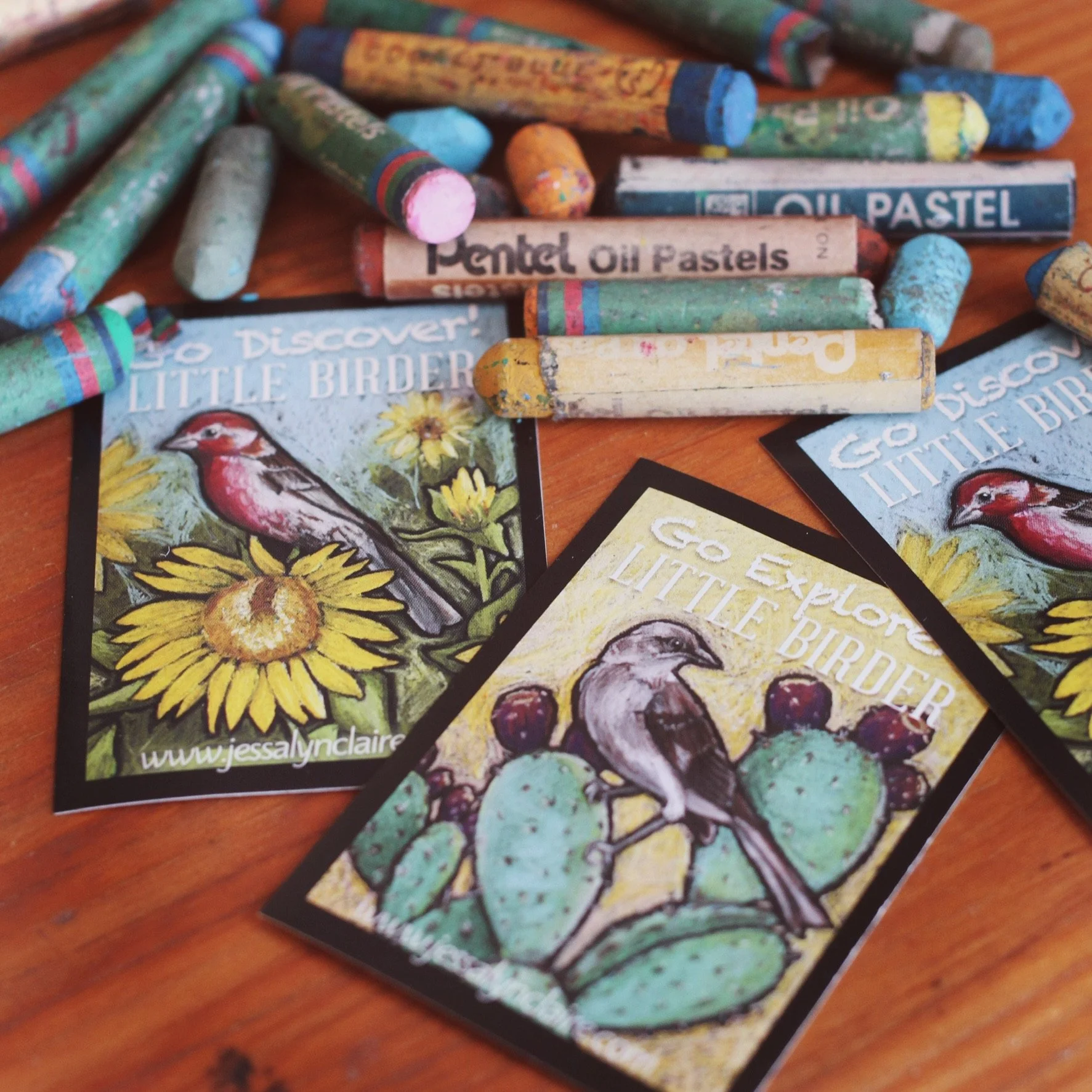
Y is for Yellow-bellied Warbler work in progress
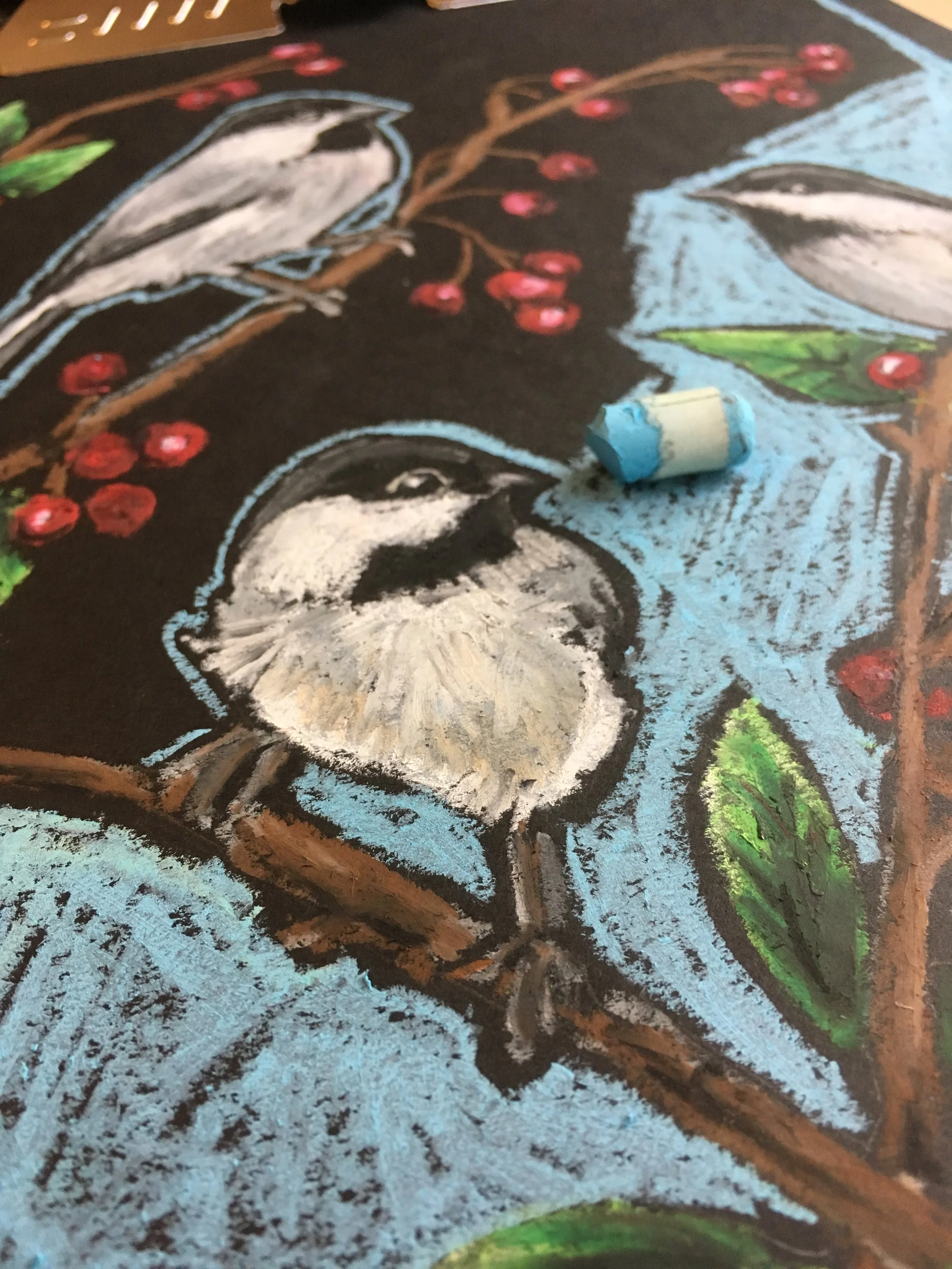
C is for Chickadee work in progress

K is for Kingfisher work in progress
Fast and Loose
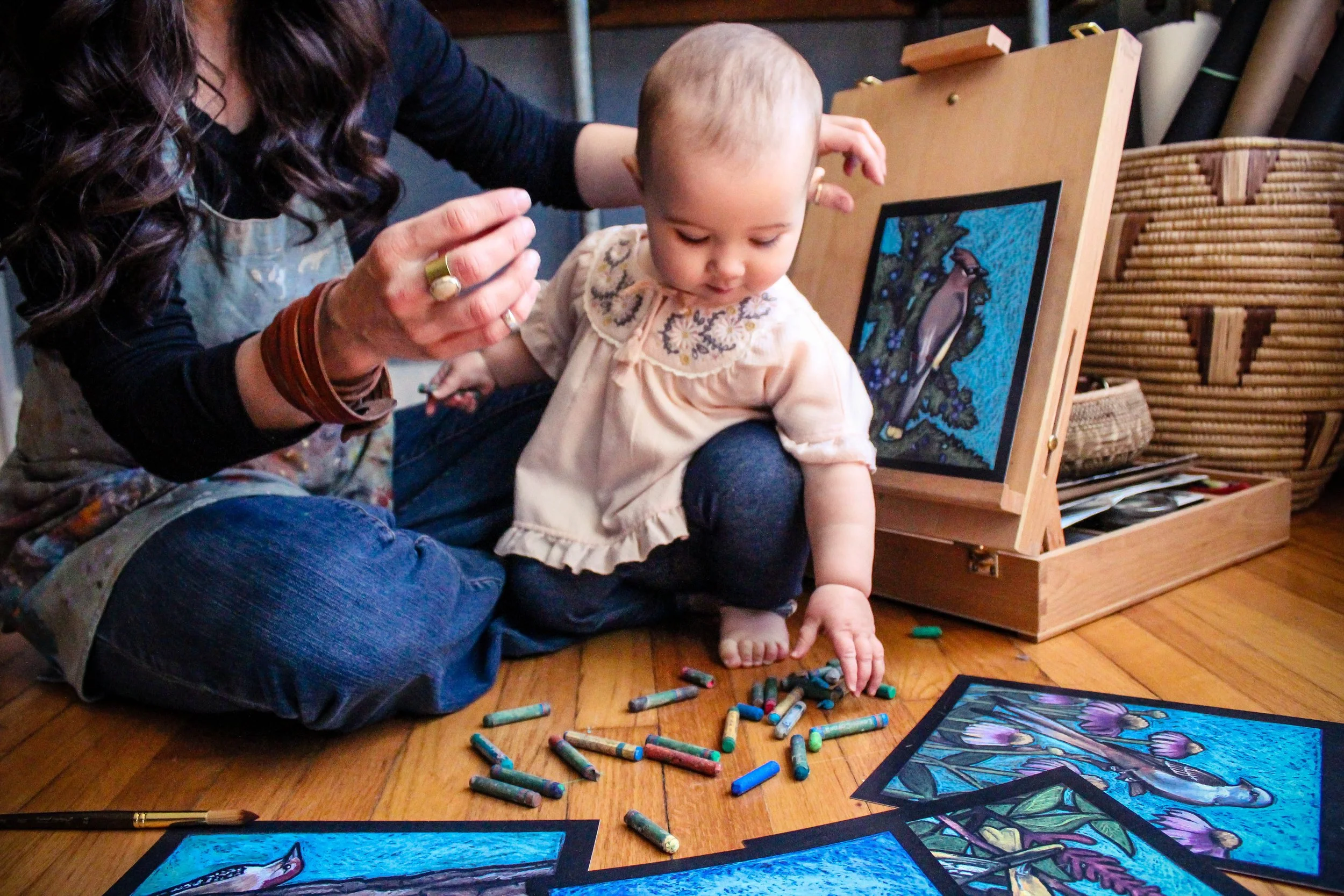

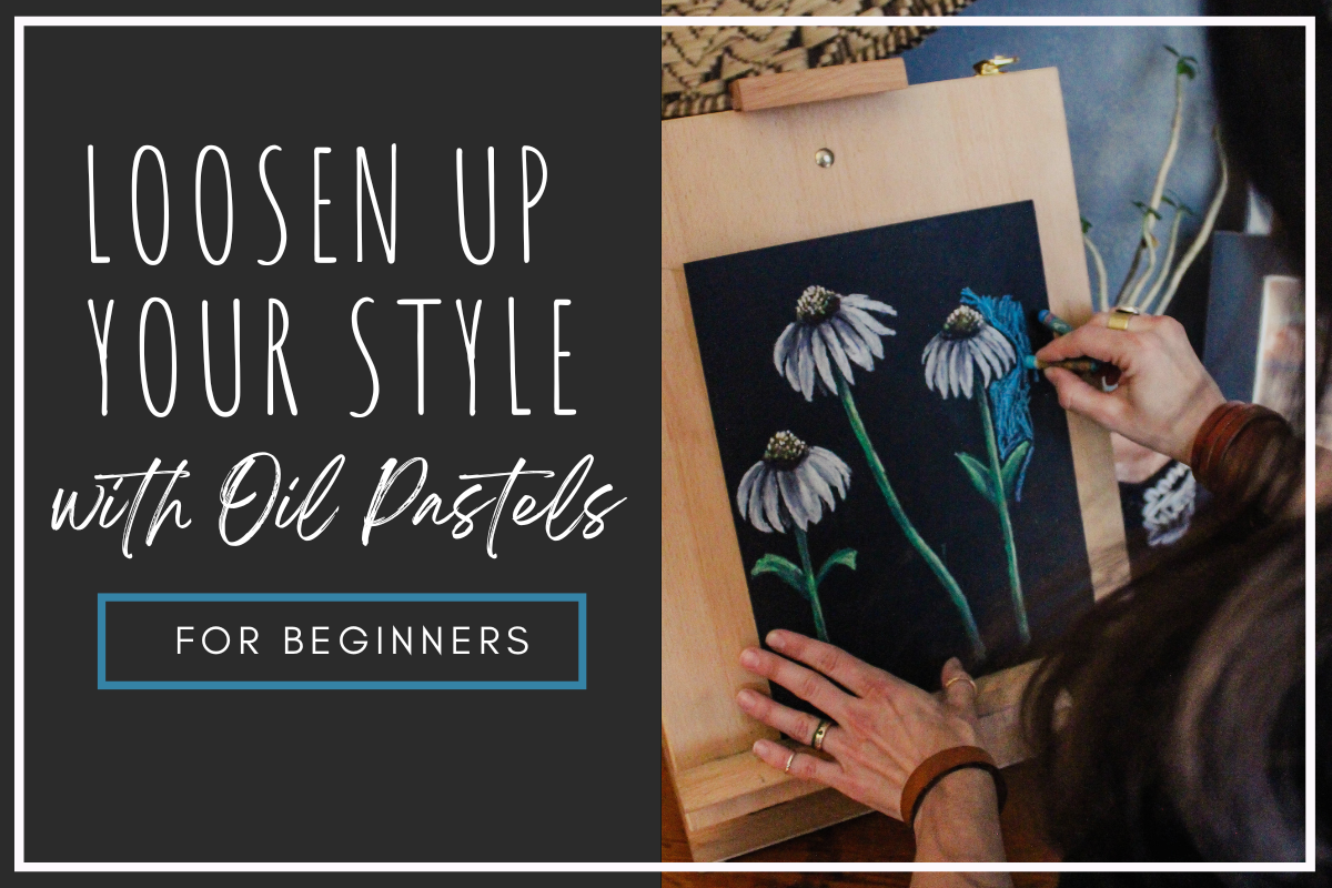
When I decided to create a children’s alphabet book about birds while at home with a new(ish) baby, I needed a medium and style that allowed for success even when illustrating with a wiggly infant on my lap. I also needed one that didn’t take hours and hours for every illustration. While researching and planning, I revisited some oil pastel animals I had done on black paper and knew I had found exactly what I was looking for.
That is how I came to illustrate Little Birder’s 26 birds in loose, bright oil pastel on black paper.
Relatively fast
Loose application
Bold illustrations
Lends itself to imperfection
I love how thick and bright the pastels cover the black paper, and I think the black paper outlines between shapes makes the colors pop and the illustrations stand out. (I mean look at this camel. What’s not to love?)

Oil Pastel Camel by Jessalyn Claire

Oil Pastel Elephant by Jessalyn Claire

Oil Pastel Horse by Jessalyn Claire

Relatively fast
Loosening up your style and attempting something similar to the examples I have shown of my developed style on black paper will also shorten the amount of time it takes to complete your artwork. The side bonus of moving toward something with more forgiveness is that it will speed up the process as you leave small imperfections and choose not to fuss over every small detail.
Troubleshooting tip: Finding yourself having a hard time not getting caught up and spending more time than you mean to in the details? Choose the area in your artwork where you want your viewer to spend the most time. Allow yourself the most time adding slow and detailed application into this area. Limit the amount of details you attempt to add into the rest of the work.
Loose application
As mentioned, Oil pastels have a variety of options for application, allowing for freedom and choice in your work. Oil pastels is one of the art mediums that can create very successful and exciting work when applied loosely.
Troubleshooting tip: Practice a loose style by picking a simple (but interesting) subject and create three versions. You can either start from precise and loosen up, or you can start with a really loose and free application, tightening up your work as you move to the second and then third versions.
Bold illustrations
Despite the fact that oil pastels vary in the thickness and opacity in their application, they all lend themselves to bright, bold results. There is flexibility to blend them in layers or apply them thickly in an impasto style, or both.
Troubleshooting tip: Do your pastels look a bit like crayon markings on the paper? I have seen students disillusioned with oil pastels only to realize that they have stopped their art too early in the process and have not built up their oil pastels enough, either with blending or with thick heavy application to make the colors pop.
If your artwork is feeling like a kids crayon drawing (and you don’t like it that way) ADD MORE. Yes, there is a point where you won’t be able to add any more without some negative effects, but if you’re having the mentioned problem, then you probably lean toward being naturally light-handed with your oil pastels. Don’t be afraid. I know it is intimidating to do something that might “mess up” the work you’ve spent time on, but so often if something doesn’t look right or “good” it is because it just isn’t finished yet.
In order to get the boldness out of the oil pastels you will want to make sure you have done one of three things:
Make sure you’ve added enough pastel that you can blend with your finger (or a solvent like baby oil) to cover the tooth of the paper. This will also take away the “crayon” effect. This would be the thinnest application of oil pastel and would likely have the most subtle effect.
Blend the oil pastel with other oil pastels until it is a soft blended surface. Layering the oil pastels will blend them into one another. There has to be enough oil pastel on the surface to be able to achieve this effect. Remember that if you are still seeing the white tooth of the paper underneath your markings (and you don’t like it) you’re not doing it wrong, you simply haven’t quite added enough layers.
Similar to the style I’ve developed on black paper, rather than slowly adding and building up oil pastel to make it thick and opaque, I simply press harder in the initial application, sometimes without layering the color. (I usually do a combination of this and the layering.) So, if you are adding marks to your artwork like this and it looks like crayon (and you don’t like it) - press harder.
Lends itself to imperfection
I find that, contrary to what you might expect, beginner artists actually lean toward being too clean and precise, and adding too much detail in their subjects. I am convinced that this is because without our own creative experience, when we view great works that are very convincing in their subject matter, we assume it is because they’ve spent more time and put more of every detail into it for us to read. In actuality, great artists are usually able to create convincing art with fewer marks and details because of how well they have come to understand things like light and shadow, form, color theory, and so on. For new artists, the tighter we are and the more detail we try to get in, without fully understanding how to do it convincingly, the less impressive and convincing our art will be.
That is why oil pastel is a great exercise in moving us away from rigidity and control, and toward loose, expressive and “imperfection” that will actually create interest and excitement in our work.
Troubleshooting Tip: To help you learn how to represent important details, try an exercise of choosing a subject matter with some degree of detail, and see how few strokes or how few shapes you can use to create a convincing representation of the subject. Try squinting your eyes while looking at your reference and only including the details you can see while squinting. Similarly you could choose a subject matter such as an apple, and attempt to paint it in the style of an impressionist artist, such as Monet.


If you’re not convinced yet, here is the thing, oil pastels are stumpy and blunt and do not lend themselves to precision details, so you’re off the hook. You can let go of perfection and set your expectations for discovery. There is a reason that I picked this style for that season of life.
If I can manage this style with a baby on my lap (who constantly tried to snack on the art materials,) then you can manage it. The key to success is to let go of perfection and enjoy the imperfection that comes with those stumpy little oil pastels.
Have you tried oil pastels yet? Comment below and let me know your experience with my favorite little artist crayons.
Follow this link to find the tutorial for an oil pastel painting in the style of my children’s book Little Birder: A Field Guide to Birds of the Alphabet.
Click the image below to get your own copy of my children’s book Little Birder: A Field Guide to Birds of the Alphabet.

