Recent Blog Posts


All Blog Posts
Looking for something specific? Try searching here.

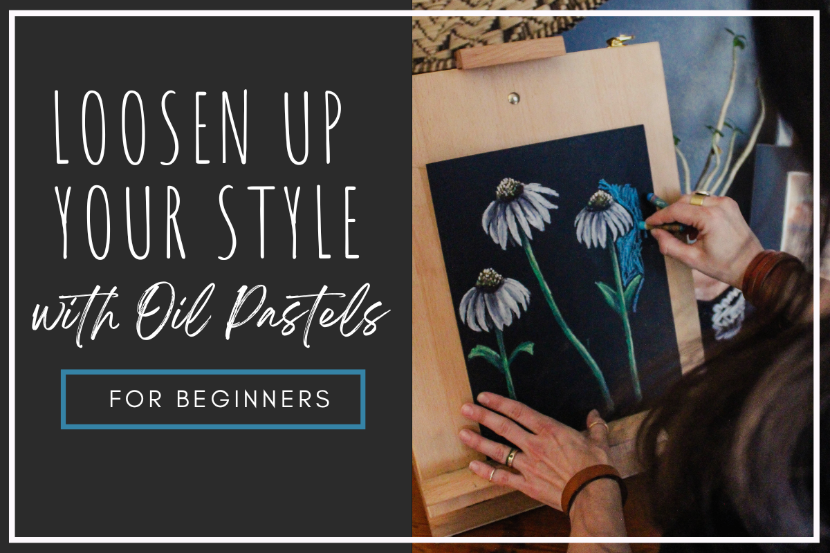
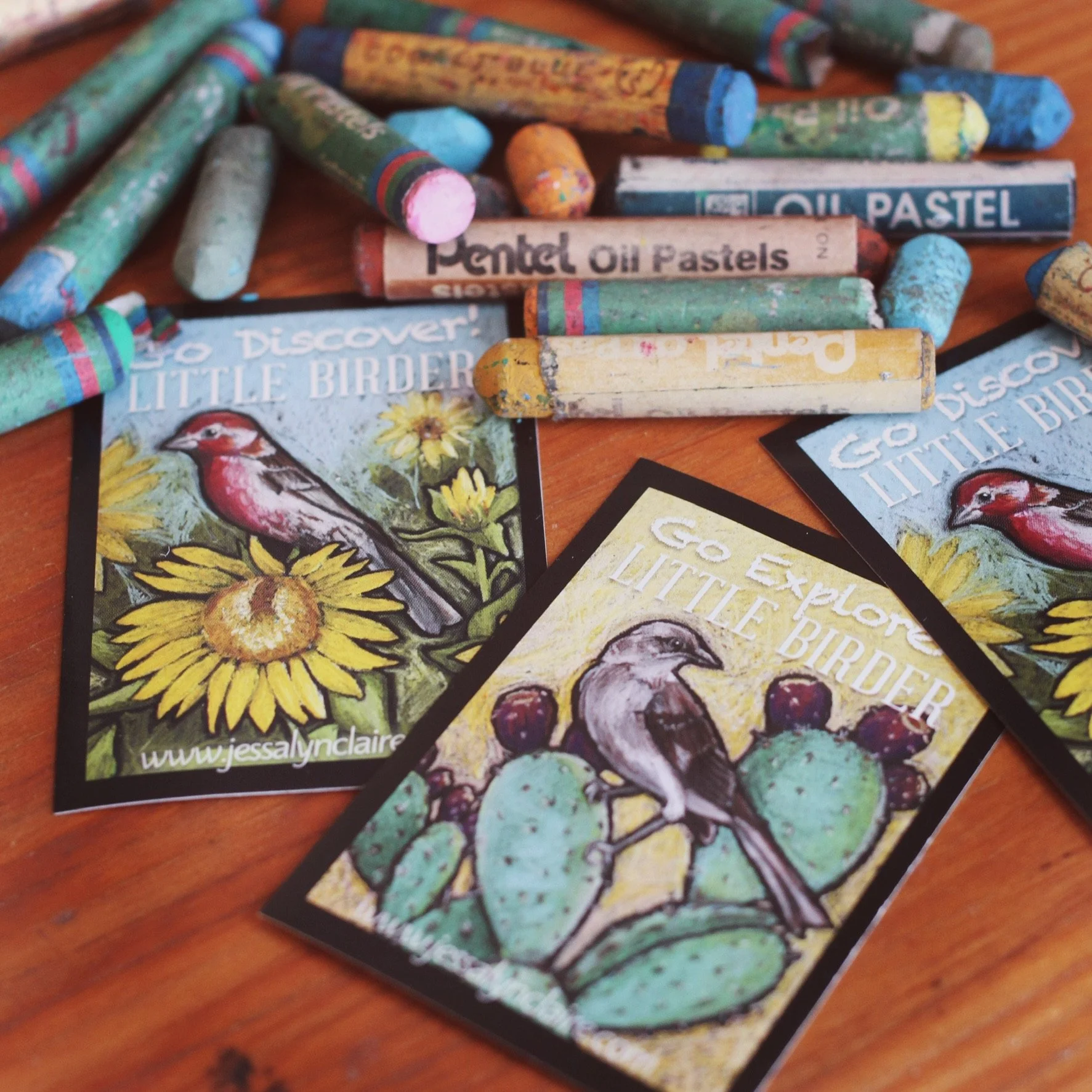
Loosen up Your Style With Oil Pastels
Oil pastels are an exciting and versatile art medium. Their convenient versatility can be the aspect of oil pastels that make them confusing to beginners. There are more than a few ways to use oil pastels. Which way is the right way?
The good news is, one of the greatest freedoms in art is that we are not bound to use the mediums in the same way others use them, or for that matter, how they’re intended to be used.
If you can get comfortable with that, then you can have endless success in oil pastel. This post is about making the most of the oil pastel’s ability to be loose, expressive and imperfect. I will introduce you to the benefits of oil pastel in its loose form. At the end of the post you can find the link to an oil pastel tutorial in the style of my children’s book illustrations.
Loosen up Your Style With Oil Pastels
This post may contain affiliate links. If you use these links to buy something I may earn a commission at no additional cost to you that allows me to continue to provide useful content. Thanks.
Oil pastels are an exciting and versatile art medium. Their convenient versatility can be the aspect of oil pastels that make them confusing to beginners. There are more than a few ways to use oil pastels. Which way is the right way?
The first confusing bit is that oil pastels are technically a painting medium that use the same motor-skills as drawing. They’re usually stumpy and blunt, so even though you have the same hand control that you would a pencil, adding details and precision is difficult.
So are they for painting or drawing? I have seen many a student become very frustrated while using oil pastels for the first time. There is an inner conflict brought about by the assumption that they should be able to create precise details, but the materials won’t behave like their pencil. It can easily create the sensation that one isn’t “good” at using oil pastels and there is a temptation to revert back to the materials we know well that make us feel in control. (Okay, maybe I’m mostly talking about me.)
Any time you get the sensation that you aren’t “good” in something in art, chances are that somewhere in your head there is a “should” or “should not” bouncing around and dictating to you what your art is supposed to be in order to be “right”.
The good news is, one of the greatest freedoms in art is that we are not bound to use the mediums in the same way others use them, or for that matter, how they’re intended to be used.
If you can get comfortable with that, then you can have endless success in oil pastel. This post is about making the most of the oil pastel’s ability to be loose, expressive and imperfect. I will introduce you to the benefits of oil pastel in its loose form. At the end of the post you can find the link to an oil pastel tutorial in the style of my children’s book illustrations.
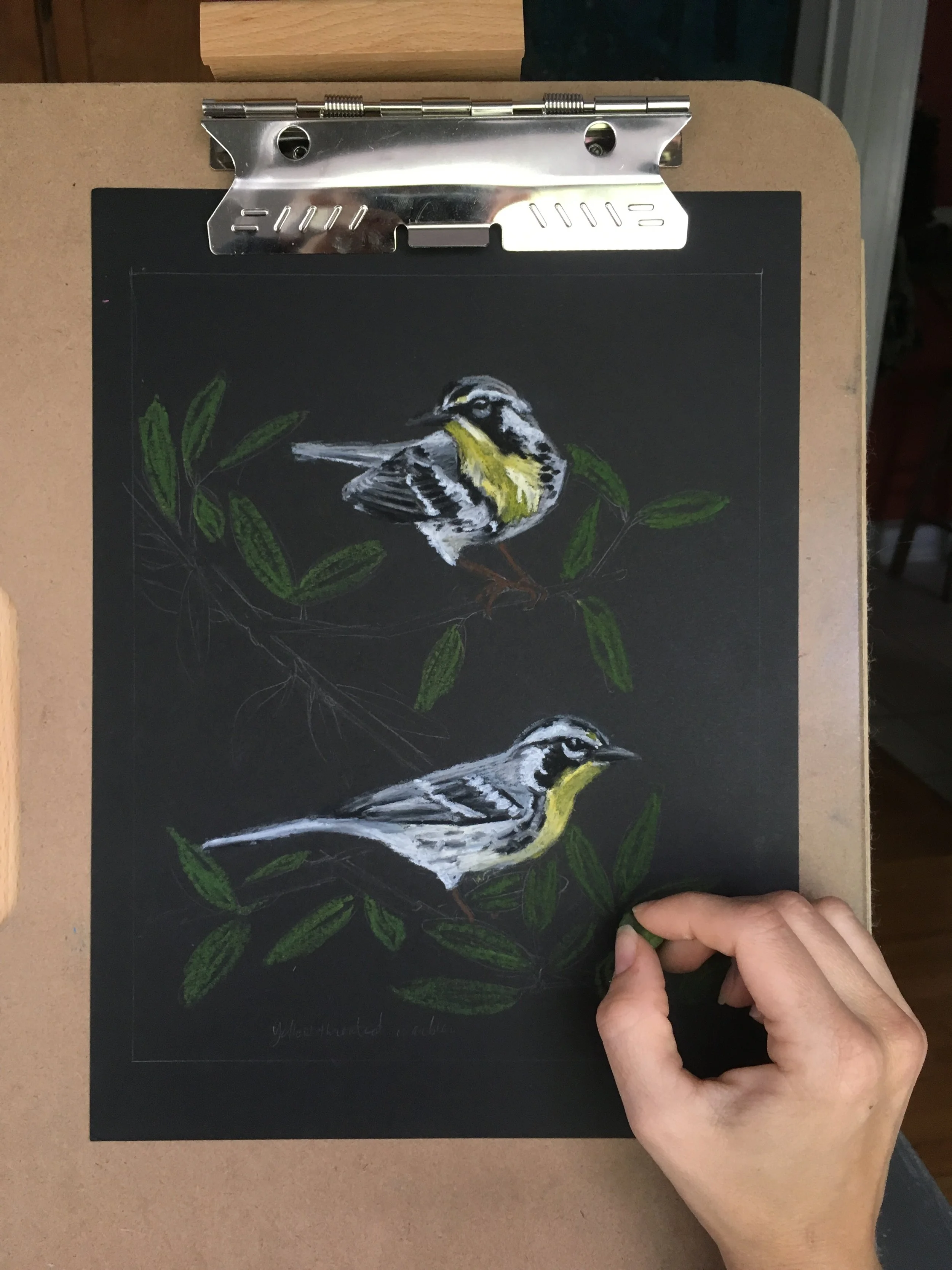
Y is for Yellow-bellied Warbler work in progress
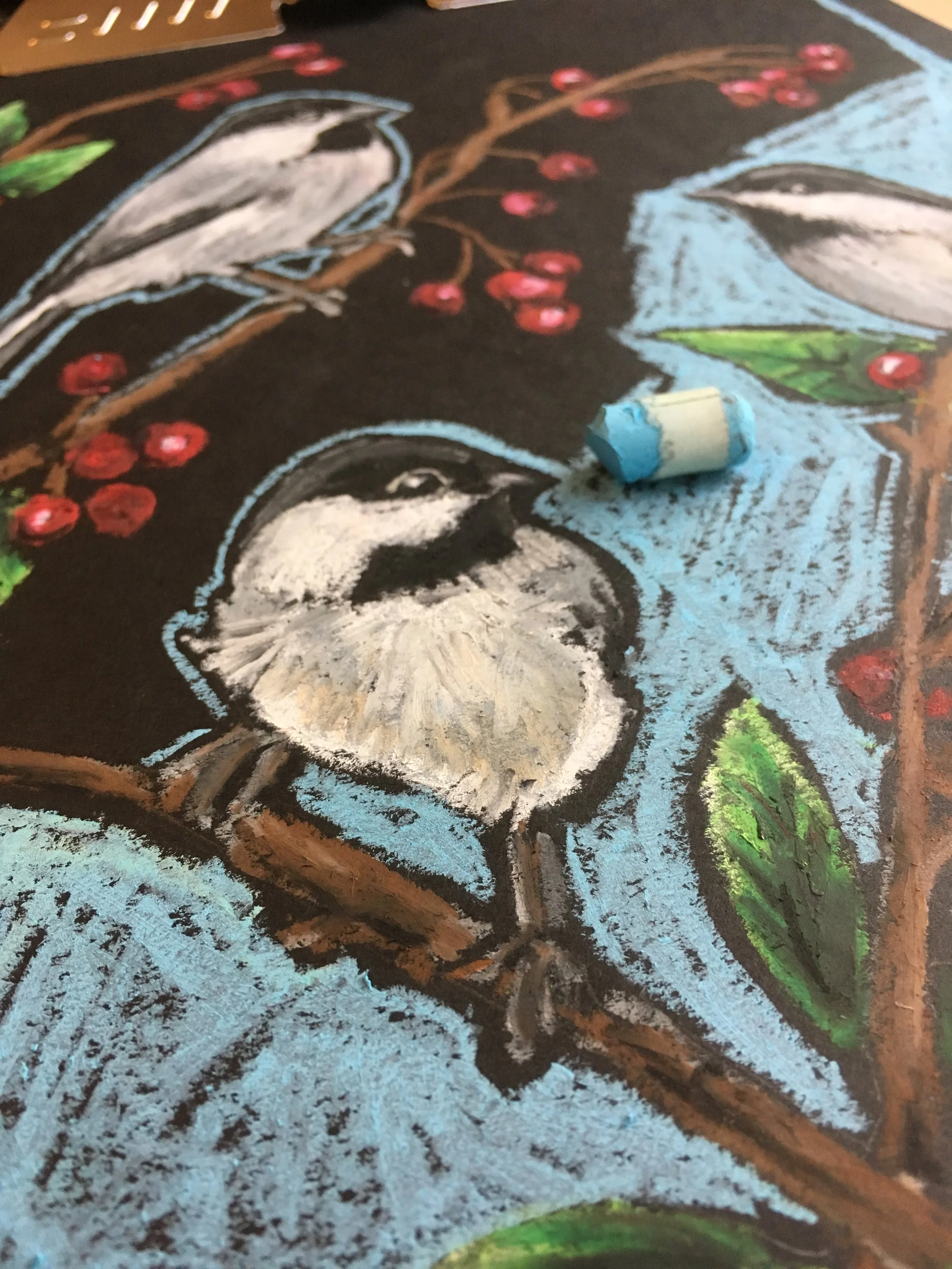
C is for Chickadee work in progress

K is for Kingfisher work in progress
Fast and Loose
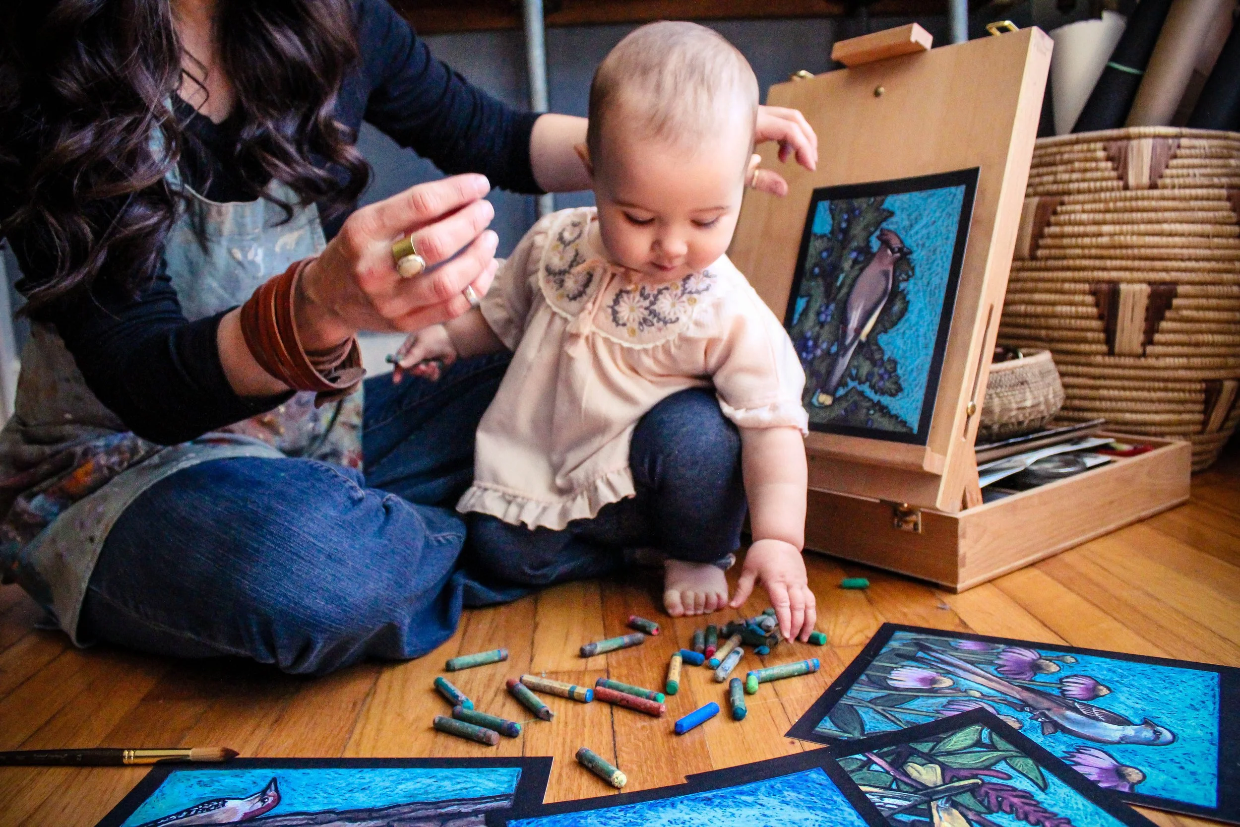

When I decided to create a children’s alphabet book about birds while at home with a new(ish) baby, I needed a medium and style that allowed for success even when illustrating with a wiggly infant on my lap. I also needed one that didn’t take hours and hours for every illustration. While researching and planning, I revisited some oil pastel animals I had done on black paper and knew I had found exactly what I was looking for.
That is how I came to illustrate Little Birder’s 26 birds in loose, bright oil pastel on black paper.
Relatively fast
Loose application
Bold illustrations
Lends itself to imperfection
I love how thick and bright the pastels cover the black paper, and I think the black paper outlines between shapes makes the colors pop and the illustrations stand out. (I mean look at this camel. What’s not to love?)

Oil Pastel Camel by Jessalyn Claire

Oil Pastel Elephant by Jessalyn Claire

Oil Pastel Horse by Jessalyn Claire

Relatively fast
Loosening up your style and attempting something similar to the examples I have shown of my developed style on black paper will also shorten the amount of time it takes to complete your artwork. The side bonus of moving toward something with more forgiveness is that it will speed up the process as you leave small imperfections and choose not to fuss over every small detail.
Troubleshooting tip: Finding yourself having a hard time not getting caught up and spending more time than you mean to in the details? Choose the area in your artwork where you want your viewer to spend the most time. Allow yourself the most time adding slow and detailed application into this area. Limit the amount of details you attempt to add into the rest of the work.
Loose application
As mentioned, Oil pastels have a variety of options for application, allowing for freedom and choice in your work. Oil pastels is one of the art mediums that can create very successful and exciting work when applied loosely.
Troubleshooting tip: Practice a loose style by picking a simple (but interesting) subject and create three versions. You can either start from precise and loosen up, or you can start with a really loose and free application, tightening up your work as you move to the second and then third versions.
Bold illustrations
Despite the fact that oil pastels vary in the thickness and opacity in their application, they all lend themselves to bright, bold results. There is flexibility to blend them in layers or apply them thickly in an impasto style, or both.
Troubleshooting tip: Do your pastels look a bit like crayon markings on the paper? I have seen students disillusioned with oil pastels only to realize that they have stopped their art too early in the process and have not built up their oil pastels enough, either with blending or with thick heavy application to make the colors pop.
If your artwork is feeling like a kids crayon drawing (and you don’t like it that way) ADD MORE. Yes, there is a point where you won’t be able to add any more without some negative effects, but if you’re having the mentioned problem, then you probably lean toward being naturally light-handed with your oil pastels. Don’t be afraid. I know it is intimidating to do something that might “mess up” the work you’ve spent time on, but so often if something doesn’t look right or “good” it is because it just isn’t finished yet.
In order to get the boldness out of the oil pastels you will want to make sure you have done one of three things:
Make sure you’ve added enough pastel that you can blend with your finger (or a solvent like baby oil) to cover the tooth of the paper. This will also take away the “crayon” effect. This would be the thinnest application of oil pastel and would likely have the most subtle effect.
Blend the oil pastel with other oil pastels until it is a soft blended surface. Layering the oil pastels will blend them into one another. There has to be enough oil pastel on the surface to be able to achieve this effect. Remember that if you are still seeing the white tooth of the paper underneath your markings (and you don’t like it) you’re not doing it wrong, you simply haven’t quite added enough layers.
Similar to the style I’ve developed on black paper, rather than slowly adding and building up oil pastel to make it thick and opaque, I simply press harder in the initial application, sometimes without layering the color. (I usually do a combination of this and the layering.) So, if you are adding marks to your artwork like this and it looks like crayon (and you don’t like it) - press harder.
Lends itself to imperfection
I find that, contrary to what you might expect, beginner artists actually lean toward being too clean and precise, and adding too much detail in their subjects. I am convinced that this is because without our own creative experience, when we view great works that are very convincing in their subject matter, we assume it is because they’ve spent more time and put more of every detail into it for us to read. In actuality, great artists are usually able to create convincing art with fewer marks and details because of how well they have come to understand things like light and shadow, form, color theory, and so on. For new artists, the tighter we are and the more detail we try to get in, without fully understanding how to do it convincingly, the less impressive and convincing our art will be.
That is why oil pastel is a great exercise in moving us away from rigidity and control, and toward loose, expressive and “imperfection” that will actually create interest and excitement in our work.
Troubleshooting Tip: To help you learn how to represent important details, try an exercise of choosing a subject matter with some degree of detail, and see how few strokes or how few shapes you can use to create a convincing representation of the subject. Try squinting your eyes while looking at your reference and only including the details you can see while squinting. Similarly you could choose a subject matter such as an apple, and attempt to paint it in the style of an impressionist artist, such as Monet.


If you’re not convinced yet, here is the thing, oil pastels are stumpy and blunt and do not lend themselves to precision details, so you’re off the hook. You can let go of perfection and set your expectations for discovery. There is a reason that I picked this style for that season of life.
If I can manage this style with a baby on my lap (who constantly tried to snack on the art materials,) then you can manage it. The key to success is to let go of perfection and enjoy the imperfection that comes with those stumpy little oil pastels.
Have you tried oil pastels yet? Comment below and let me know your experience with my favorite little artist crayons.
Follow this link to find the tutorial for an oil pastel painting in the style of my children’s book Little Birder: A Field Guide to Birds of the Alphabet.
Click the image below to get your own copy of my children’s book Little Birder: A Field Guide to Birds of the Alphabet.


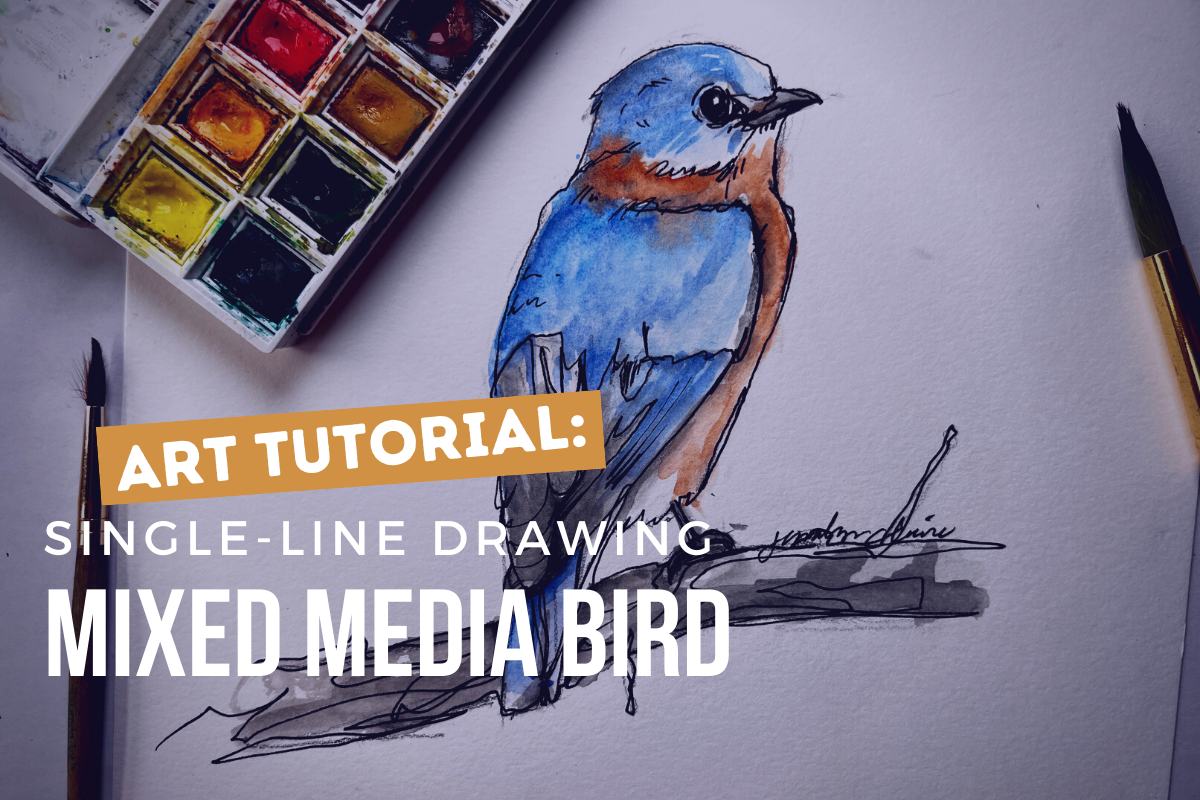
How to: Expressive Oil Pastel Illustrations (in the Style of the Children's Book Little Birder)
Do you want to use oil pastels but don’t know where to start? In this tutorial I will walk you through the steps to illustrate an oil pastel bird (or any subject matter) in the style of my children’s book “Little Birder: A Field Guide to Birds of the Alphabet”. This stye is bright and impactful and makes the most of oil pastel’s appealing qualities, but it does not require perfection or years of mastery and can be painted in a relatively short time.
This is a great place to start your oil pastel journey or continue to develop your own style using the versatile medium of oil pastels.
How To: Expressive Oil Pastel Illustrations
(in the Style of my Children’s Book)


This post may contain affiliate links. If you use these links to buy something I may earn a commission at no additional cost to you that allows me to continue to provide useful content. Thanks.
Do you want to use oil pastels but don’t know where to start? In this tutorial I will walk you through the steps to illustrate an oil pastel bird (or any subject matter) in the style of my children’s book “Little Birder: A Field Guide to Birds of the Alphabet”. This stye is bright and impactful and makes the most of oil pastel’s appealing qualities, but it does not require perfection or years of mastery and can be painted in a relatively short time.
This is a great place to start your oil pastel journey or continue to develop your own style using the versatile medium of oil pastels.


Supplies
Oil Pastels ( I enjoy this Pentel set or this Sakura set)
Pencil & eraser
Optional:
Washi, Masking, or painter's tape
Drawing board or cardboard backing
Hand warmers- for those of you who are painting your bird outside in freezing weather like me (I can’t recommend it.)
*As an Amazon Associate I earn from qualifying purchases.
Getting Started

To get started, I always tape the edges of my paper. This is optional, as you could also just illustrate all the way to the edge of your paper. It’s really a preference thing.
If you do tape, remember to lessen the stickiness of your painter’s tape, masking tape, or washi tape by sticking it to your pants a few times. This will help prevent the tape from tearing your paper when you remove it. *The longer your tape stays on, the more likely it is to damage your paper when it comes off. If you stop your work and come back, say… a month later, the tape will make some protests when you try to remove it.

Sketch your composition
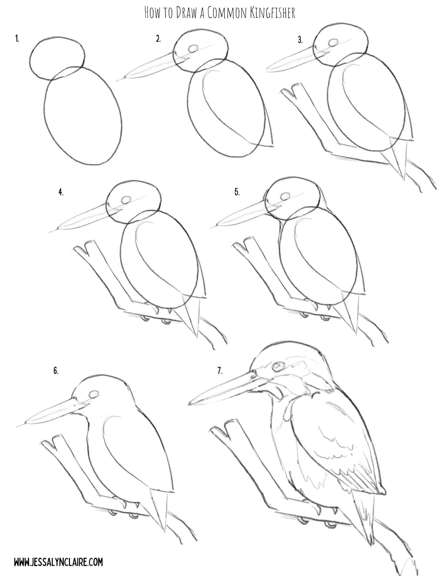
The next step will be to sketch your composition. I have provided a step by step illustration that you can use to practice your oil pastel artwork here, or you can create your own drawing.
Don’t worry about being cautious the pencil for your sketch, unlike other mediums the oil pastel will cover it and it does not stand out on the black paper.


Starting With Oil Pastels
For this tutorial I’ve chosen the Common Kingfisher because as mentioned, blues go down very opaque and bright on the black paper, requiring less experimenting to get the colors to show. However, it also has an area of orange, which is one of the colors that can require putting white down first before adding the color to create the opacity and vibrancy. This will allow us opportunity to discuss and practice both in our painting.
To begin the illustration, I begin with the main subject matter first. This is where I put most of my time into fine details. I focus my detail work on important areas like the face, eyes, etc. Use this to draw the viewers eye to the place in the work you want them to see most.
Notes about oil pastels on black paper:
Some colors go on more transparent and some more opaque.
The most opaque colors are white, blues, greens, pinks, some reds and purples, the light or pastel versions of all of the colors.
The most transparent colors are yellow & orange, some reds and purples, the darkest versions of all of the colors.
If you use white underneath one of the transparent colors it will show up more vibrantly as if it is opaque (but slightly more pastel in color).
Use the black paper to your advantage by let the black paper show through in places for the darkest areas and to create contrast.
Step by Step
STEP 1
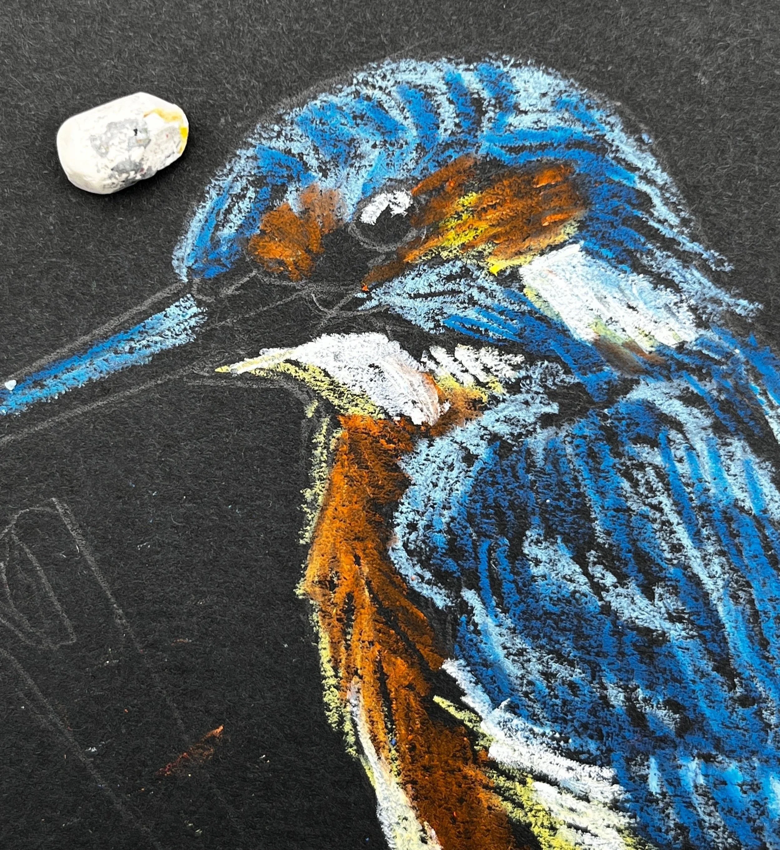
Starting with a light blue pastel. Block a thin layer into the areas of blue feathers on your kingfisher. You only need to start with a thin layer. The key to oil pastel is building up in layers, but adding more is easier than removing color from your work. So there is no rush to get thick pigment onto the paper. The point is to block in the light and dark shapes of color so you begin to see the shape form. There is no need to get overly detailed yet, but don’t be overly generic with laying down color either. Try to add your color in the direction of the feathers and pay attention to the shapes of the highlights.


STEP 2
2. Select a color that closely resembles the darker blue hues in the bird and begin the same process, adding marks in the direction of the feathers. Apply it thicker in areas that will become even darker as you progress. Tip: The light blue applies the same principles as the white. Because of its lightness and opacity you can apply it beneath the darker blue to intensify the colors. It is not necessary with the blue hues, and I like to mark in the various shades of blue as they are to give myself the ability to begin to see the shape and structure appear. Keeping this in mind though, it is okay to apply the light blue liberally underneath, as it will blend with the darker hues that are applied on top.


STEP 3
3. Next, referring to the chart above, decide how you will apply the yellows and orange hues, still following the same process as the light and darker blues where lighter colors are applied first and attention is paid to the broad shapes of color. Begin with the lightest yellow or white. I use a pastel yellow because it behaves similar to a white underneath the following layers, but it still adds the warmth and hue of the yellow. If you do not have this pastel, I recommend a very thin layer of white underneath. Mark first the light highlight areas and then follow with the orange hues.


STEP 4
4. Unlike in other mediums, white oil pastels can be applied over other colors that are darker, though it will not always completely cover the color beneath it. This ability is because of its thickness and opacity. This means, that unless you are applying white down before applying a transparent color, you do not have to start with the white areas first, but we will begin working from lighter versions of color, and move darker. Since this Kingfisher has bright white areas, treat them as you have the other shapes of color. They are solid white so you do not have to layer lightly. Simply press harder and take a single pass. Also add in some specks of white for the reflection in the eye and lighten the top of the bill. With both of these areas you can use the black pastel at the end of your artwork to correct any mistakes so just attempt these details with any tip or edge you can find on your white pastel.


STEP 5
5. Next I go over the areas where I have already laid down a layer of color. For the orange chest area, I looked closely at the areas of light and dark within the orange and applied another layer of one, or both of the oil pastels I used previously. Before applying another layer of orange, to brighten the dark areas of orange pastel I very lightly applied a stroke or two of the pastel yellow. In this case it does not color the area, but it adds enough oil and pigment to give the orange pastel something to blend with and creates less transparency. The opaque color will also make the orange more vibrant. If you look closely within each color you will see lots of variation of shades. Squint your eyes and try to focus on the large areas of light and dark that you see left.

STEP 6
6. From here you can continue to go back and forth, layering the pigments up. Add light blue back on top in areas to create the suggestion of the patterns in the feathers. You will know you are getting close to where you want it to be when you start seeing areas of the painting blending and appearing more like paint than crayon. However, it is okay to see some black paper coming through in some areas. Select the areas where you want the pastel layers to be dense, but don’t worry about getting rid of the paper completely. Always build up slowly and thoughtfully. Remember, you can add more easily than you can remove what you’ve already applied.


STEP 7
7. Select a color for the branch. I selected a medium gray and then applied the olive green that will be the background color to the underside. This gives the sense of a reflected light. You do not have to be as careful or slow in building up the color on the branch. You can now blend a small amount of black into some lower areas to create shadow and white on the top edge, or you can wait to do it closer to the end.


STEP 8
8.At this point I begin the background. First I trace around the image leaving a black border between the background and the subject matter. This is my stylistic preference and is optional. Apply the background very loosely, leaving some of the black paper coming through. In order to do this well, you will apply the oil pastel with firmer pressure so that each stroke solidly covers the paper. This prevents the need to make multiple passes.


STEP 9
9. The last step is to touch up with the black pastel. First I apply it into the eye and on the beak. If you accidentally cover the white spots, don’t fret. You can simply come back and press your white pastel onto the spot again and leave another white dot on top. I blend a small amount of black into the darkest shadow areas in the blue feathers to create more contrast. I do not always add black to the black borders around the subject, but I do when I need to clean something up and create a sharper edge.

STEP 10
10. Remove the tape. Tip: To prevent damage to your paper, pull the tape very slowly and angled out rather than straight down. Don’t forget to sign your work!


That’s it! Did you find yourself enjoying the freedom of imperfection? If you have questions or comments be sure to leave them below.


Sparking Creativity | Kids with Oil Pastels | Art Tutorial
This style is intentionally imperfect but the defining features of the bright oil pastels, with heavy black outlines, created by expressive markings on black paper is like an elevated version of the crayon scribbles we all know and love. It is amazing how this small change from crayons to oil pastels, white to black paper, and some intentional black outlines will create stunningly eye-catching artwork from the same little hands that brought you that lovely chicken-dog blob that has been hanging on the fridge since it came home from school on Father’s Day.
Sparking Creativity
Kids with Oil Pastels- Fun Winter Owl Art Tutorial
This post may contain affiliate links. If you use these links to buy something I may earn a commission at no additional cost to you that allows me to continue to provide useful content. Thanks.
I have been familiar with oil pastels for years, but I really found a new appreciation for their potential during the creation of my children’s book, Little Birder: A Field Guide to Birds of the Alphabet. It was a mound of work to illustrate a bird painting for each letter of the alphabet, a task which I often did with my infant daughter tucked under an arm on my lap. The situation called for a medium and style that suited a one-handed illustrator, strapped to a wiggly baby making continual attempts to eat the art materials. That exciting scenario is where I first began to appreciate the forced imperfection of the stubby little crayon-like colors with a mind of their own.

Fast forward a few years and I still love the signature style of the illustrations in my book, plus I now have an artistic four year old. One day it struck me, this is a PERFECT art project for small hands and developing motor skills. The style is intentionally imperfect but the defining features of the bright oil pastels, with heavy black outlines, created by expressive markings on black paper is like an elevated version of the crayon scribbles we all know and love. It is amazing how this small change from crayons to oil pastels, white to black paper, and some intentional black outlines will create stunningly eye-catching artwork from the same little hands that brought you that lovely chicken-dog blob that has been hanging on the fridge since it came home from school on Father’s Day.
WANT TO READ AHEAD?
JUMP TO:
MATERIALS
The material needs are few for this project. The good news is that once you’ve purchased the parts, your child can continue to enjoy the surprising and satisfying outcomes of putting the bright pastels on black paper. Even without following a drawing or tutorial, those everyday scribbles can have a very modern artist-like feel.
Pencil and Eraser
Optional:
Washi Tape or Painter’s Tape for creating a clean border around the artwork
Kids' Apron to protect clothing
Brown paper roll, or something to protect table or working surface
Please note: Oil Pastels are made with… you guessed it, oil. Unlike the art materials made for children, these are not made to be washed out. If this is a concern for you, you can always opt for a water-soluble set like this and will be more likely to get it out of fabrics.
*As an Amazon Associate I earn from qualifying purchases.
Let’s begin!

Step One: Pencil Sketch
Follow the steps below to sketch your owl drawing onto the black paper. You don’t have to be too cautious because the oil pastel will mostly cover any pencil marks.

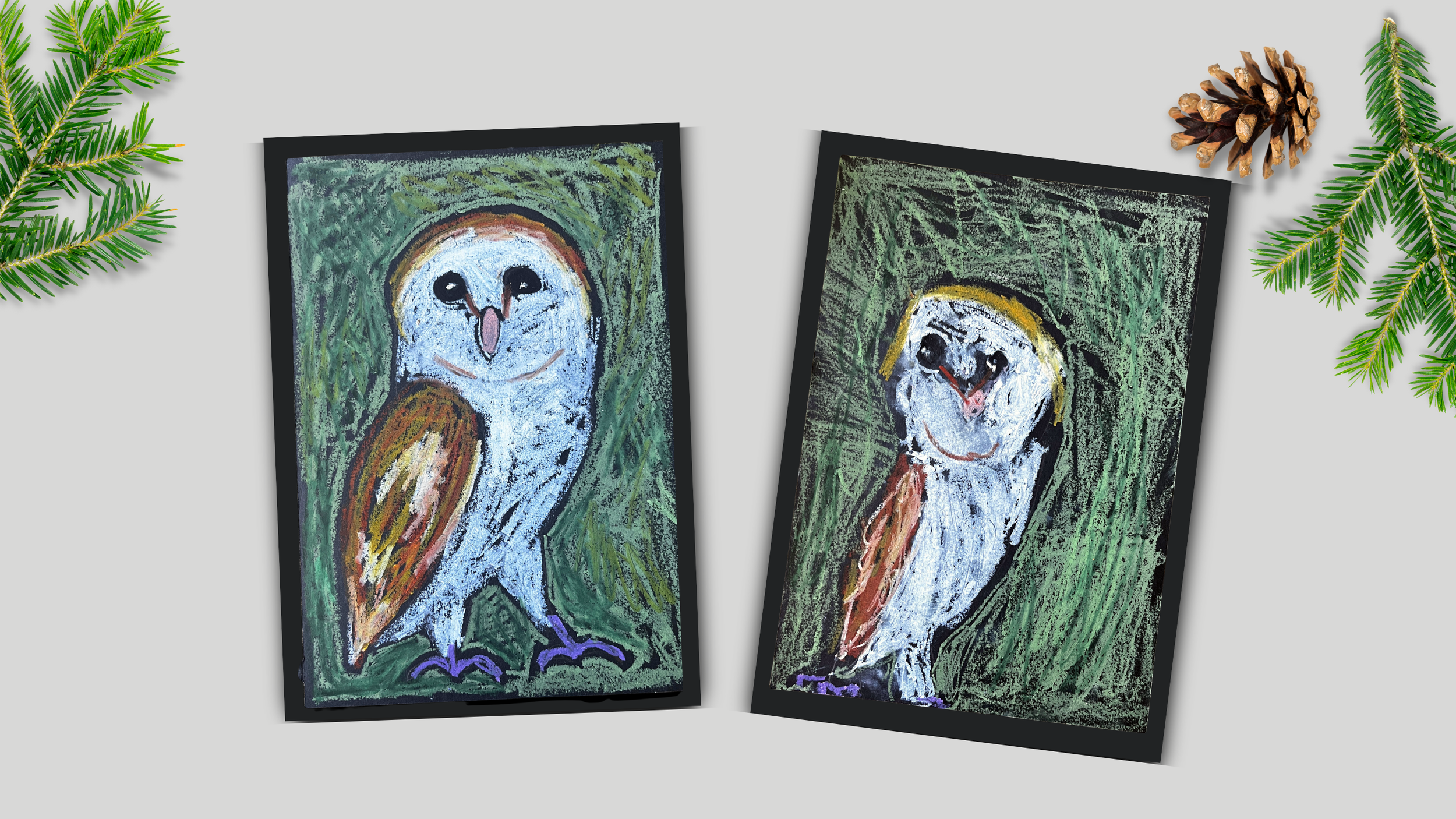
Step Two: Add Oil Pastel - Painting the owl
After you have your pencil sketch ready to guide you, you’re ready to add color with oil pastels. If you would like to use the same colors as the example find a selection of these colors: white, various browns, orange, yellow, purple, various greens and a black. Feel free to get creative with your background or details.
Optional: I really like to tape the edges of the paper so that the child can freely paint right up to the border, but when the tape is removed you’re left with a very satisfying sharp edge to the lovely work of art. If you decide to do this, make sure you “unsticky” the tape a bit by sticking it to your clothing a few times before putting it onto the paper. Washi tape is less likely to damage the paper as you remove it, but you make the judgement call. When removing the tape, pull down slowly at a slight angle outward rather than straight down.

Start adding color by taking the white oil pastel and tracing a border around each of the markings on the face. Trace around the eyes and beak, leaving the V shaped marking in the middle of the face. Trace right up next to the outline of the head and inside the body, leaving the wing black. This includes the two triangular leg shapes which will also be solid white.
After creating this border to guide your painting, freely add white oil pastel in scribbling motions into the areas that will be white. Be sure to let some of the black paper show through and don’t paint over any of the features of the face or other parts of the body. It is better to stop far away and come back later than to accidentally go too far.
Next, take a yellow or a pink oil pastel and paint the almond shaped beak, trying to stay within the line.
For the eyes, you can either leave the black of the paper showing and add white oil pastel right up to the outline of the eye to define a black circle, or you can fill in the eye with the black oil pastel. The black oil pastel will cover all other colors of oil pastel, so it is great for cleaning up that black eye circle if you happened to accidentally go too far with the white. To finish the eye, add a white spot on either side of the eye for the reflection, keeping it to the same side of each eye.
Take a brown oil pastel and draw the two lines that run from the inside of the eye down to the beak that create a sort of V-shape. Then add a curved line a small distance from the bottom of the beak to separate the shape of the white face from the white body.
With a lighter brown, gold, or even a light orange color, trace the shape of the wing, defining it from the white of the body with a black outline. Add a light layer of this color inside the wing and then add the darker brown to the upper and lower portions of the wing on top of the first color. Add a few strokes of white in a few spots in the middle portion of the wing.
Take the same two colors and add a “headband” of color to the top of the owl’s head. You can overlap with the white a little to blend the colors.
Choose a color for the feet. I liked the pop of purple against the other colors and the green background, but you can select something true to real life if you prefer it. Draw over the sketch of the feet with your oil pastel however thick or thin you find appealing.
Step Three:Add Oil Pastel- The Background
Remember that the crux of our style is the heavy black outlines that separate large elements from one another in the painting. This can be hard for younger children, as it is a bit like having to stay inside the lines and requires somewhat matured motor skills. You can assist by tracing their owl with the background color and leaving a black outline that is a safe distance away from their work, this allows them to go wild up to that line without as much risk of overlap. Then take the green colors (or bright blue could be nice too) and start filling in the background to look like the spiky needles of a pine or evergreen. To mimic the original style, try to leave some black showing through the marks rather than covering the background surface in oil pastel.
Again, the black oil pastel will cover the other pastels, so you could alternatively let your child try to leave the border and fill the background on their own and then help them redefine the black border anywhere that it has disappeared or needs to be made bolder. You can also clean up the black outlines within the owl in areas like around the wing, and around the beak if you choose to.

AND DONE!
Add some initials or signature, peel the tape and you’re done! Like oil paint, oil pastels take a long time to fully cure so your art will stay somewhat sticky and smear-able. If you would like to spray your art to seal it, try a couple of layers of a matte fixative like this one. (Follow the directions! Adults only.)

Click the image to sign your child up for an oil pastel lesson with me on Outschool.com!


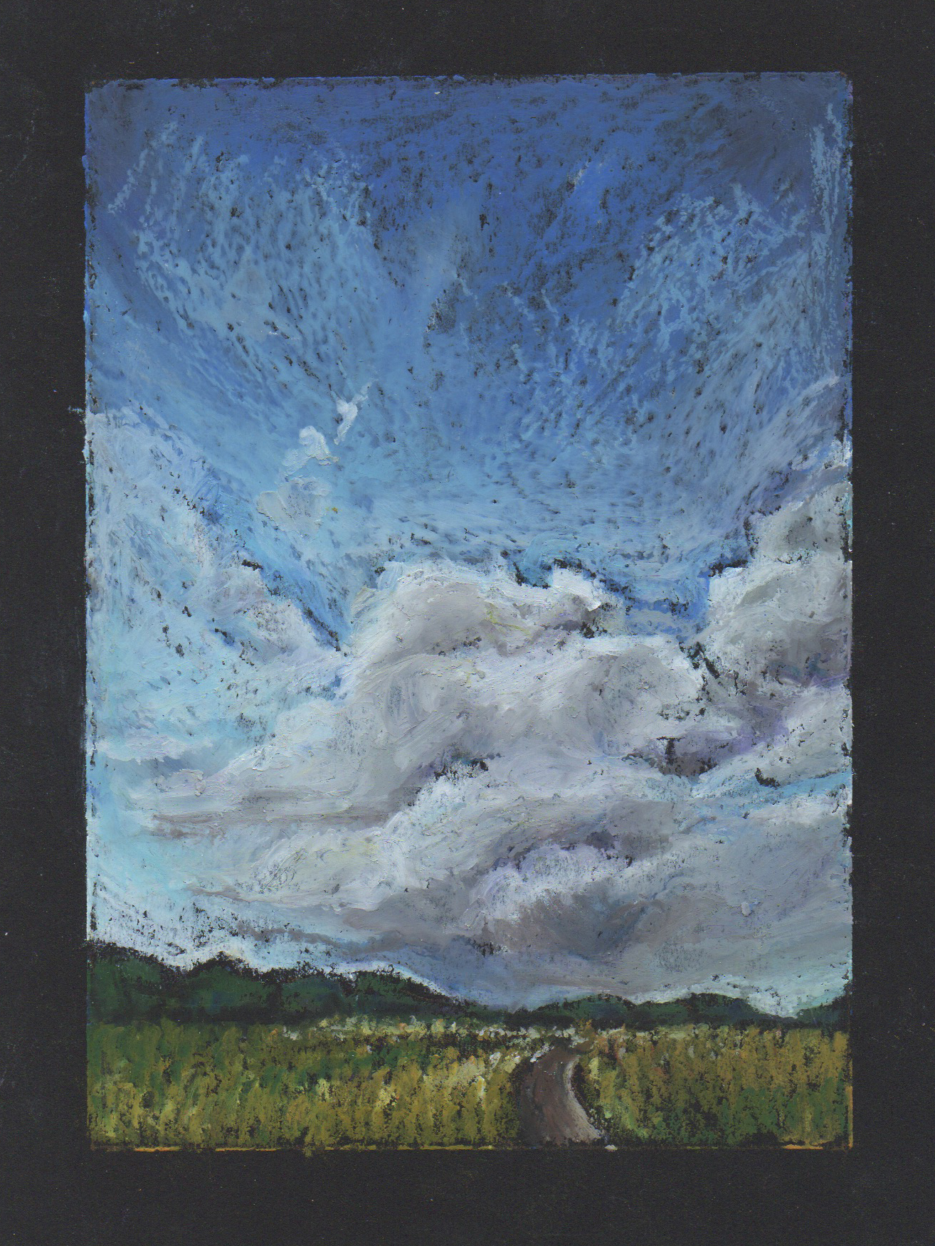
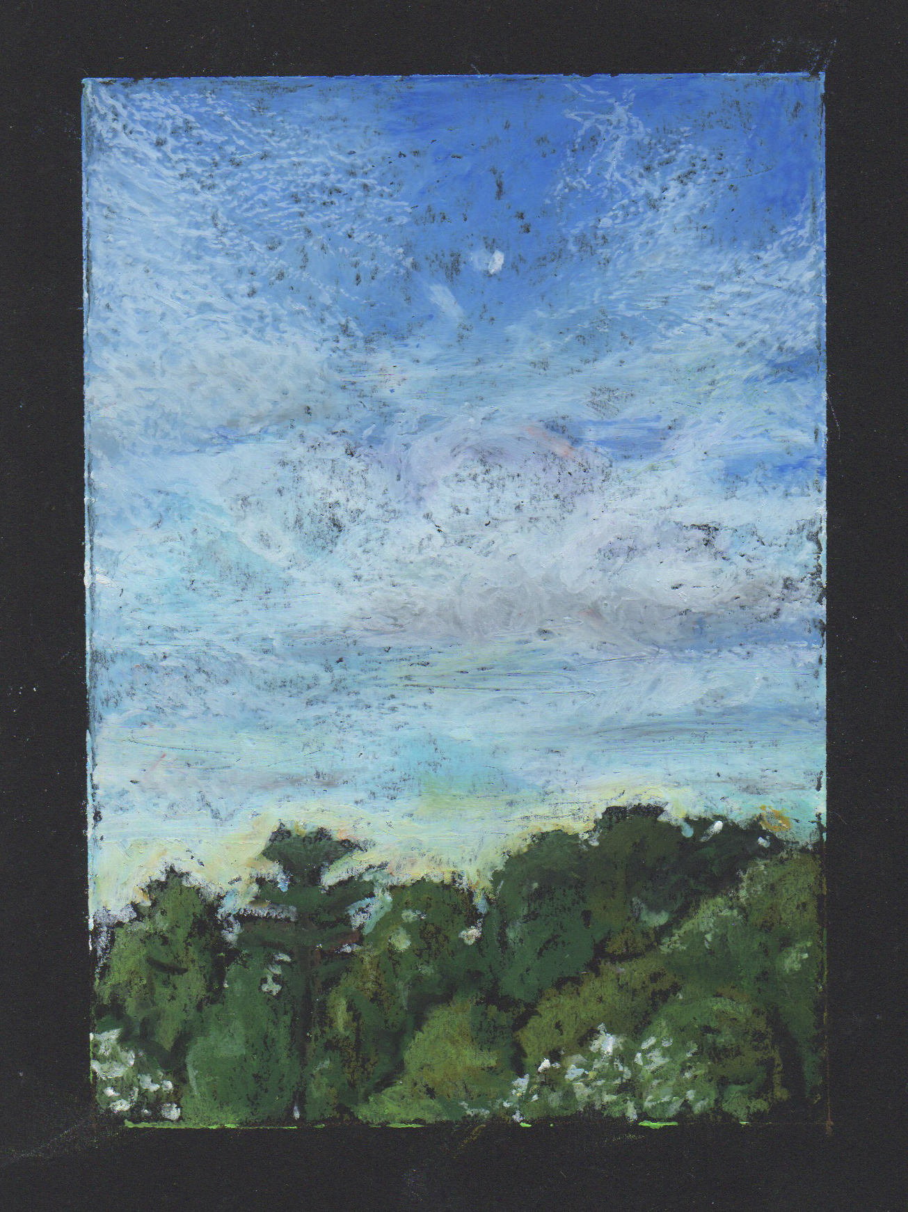
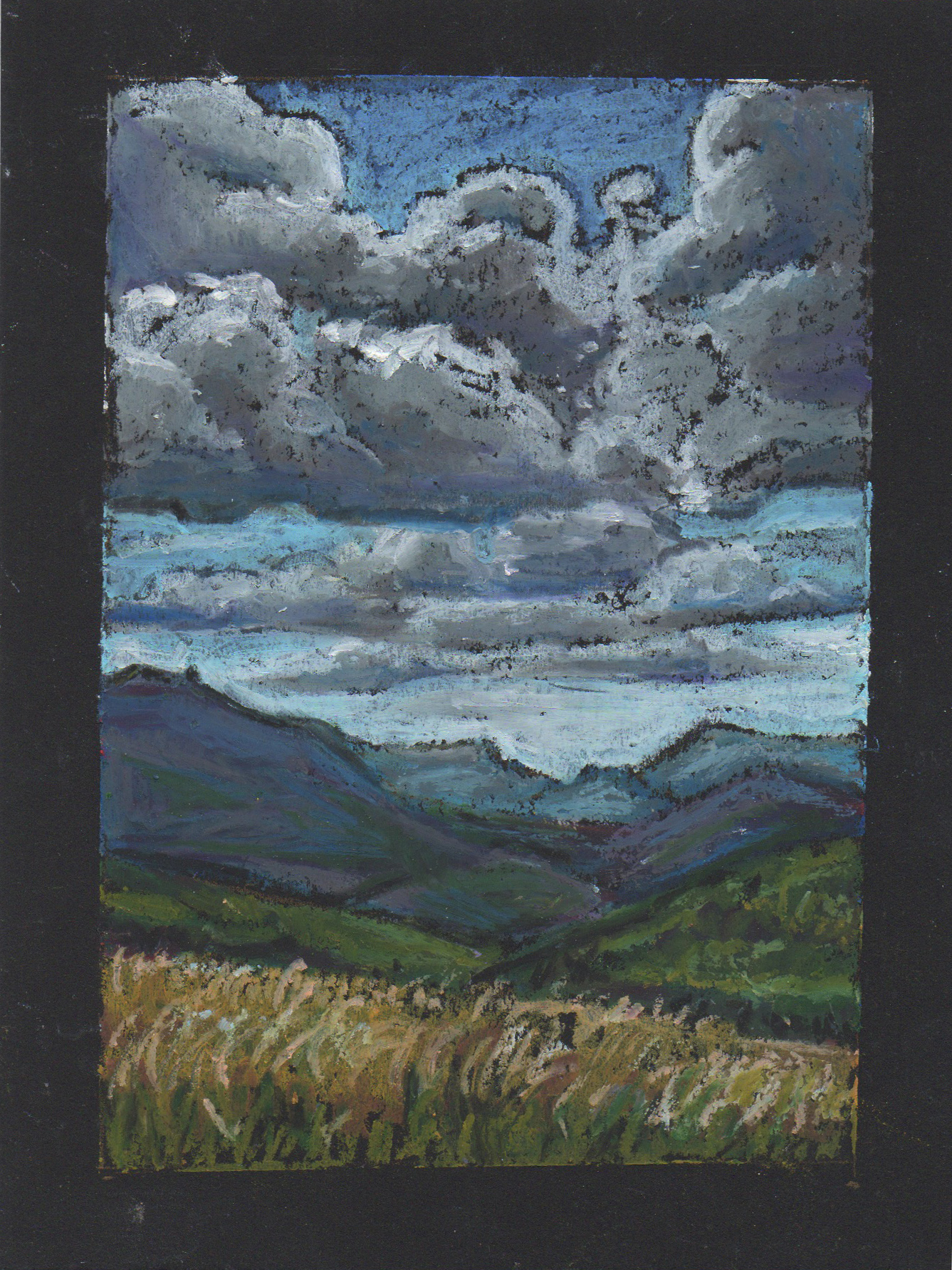
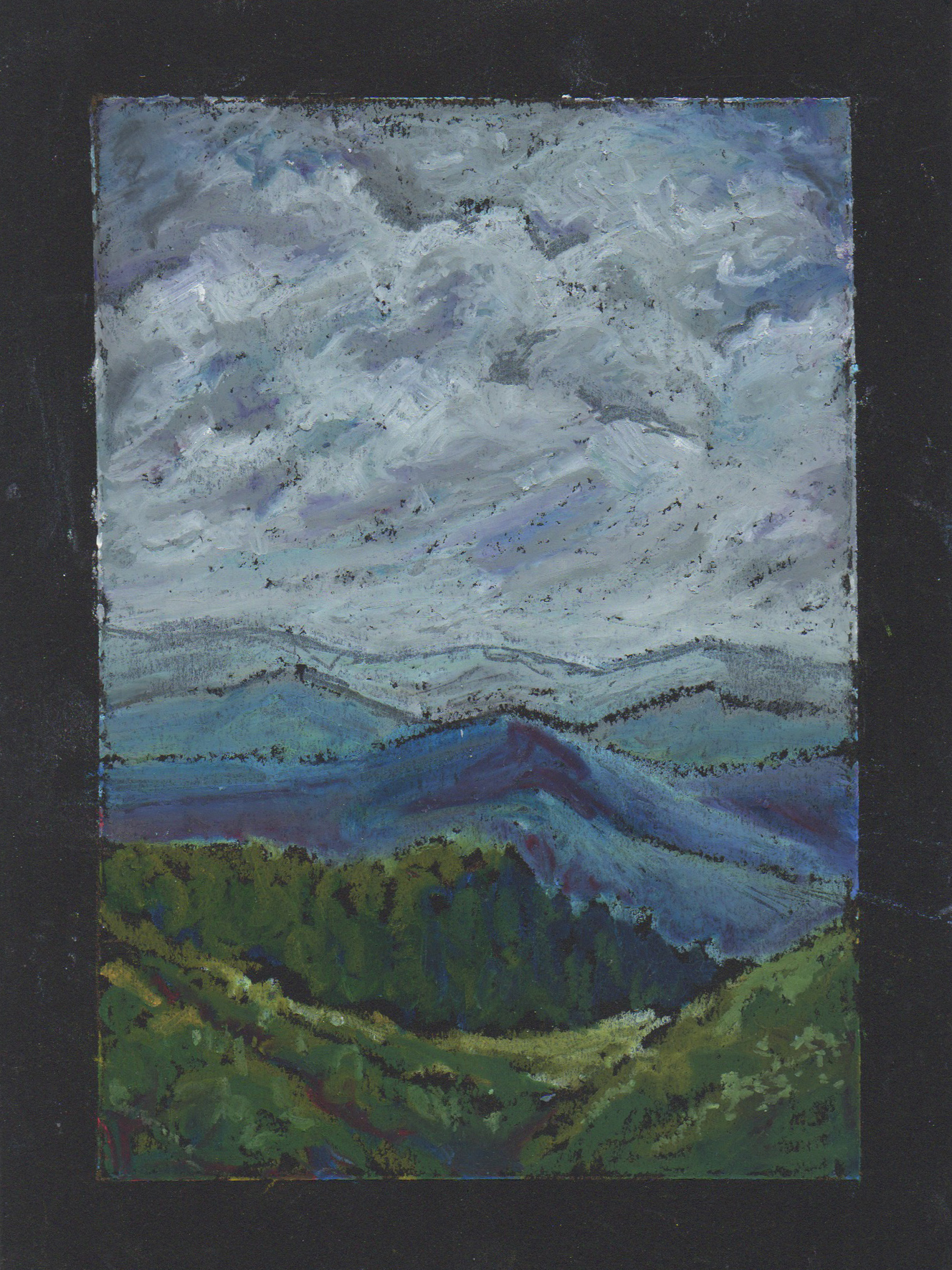
Beyond Wildlife- A Series of Mini Oil Pastel Landscapes
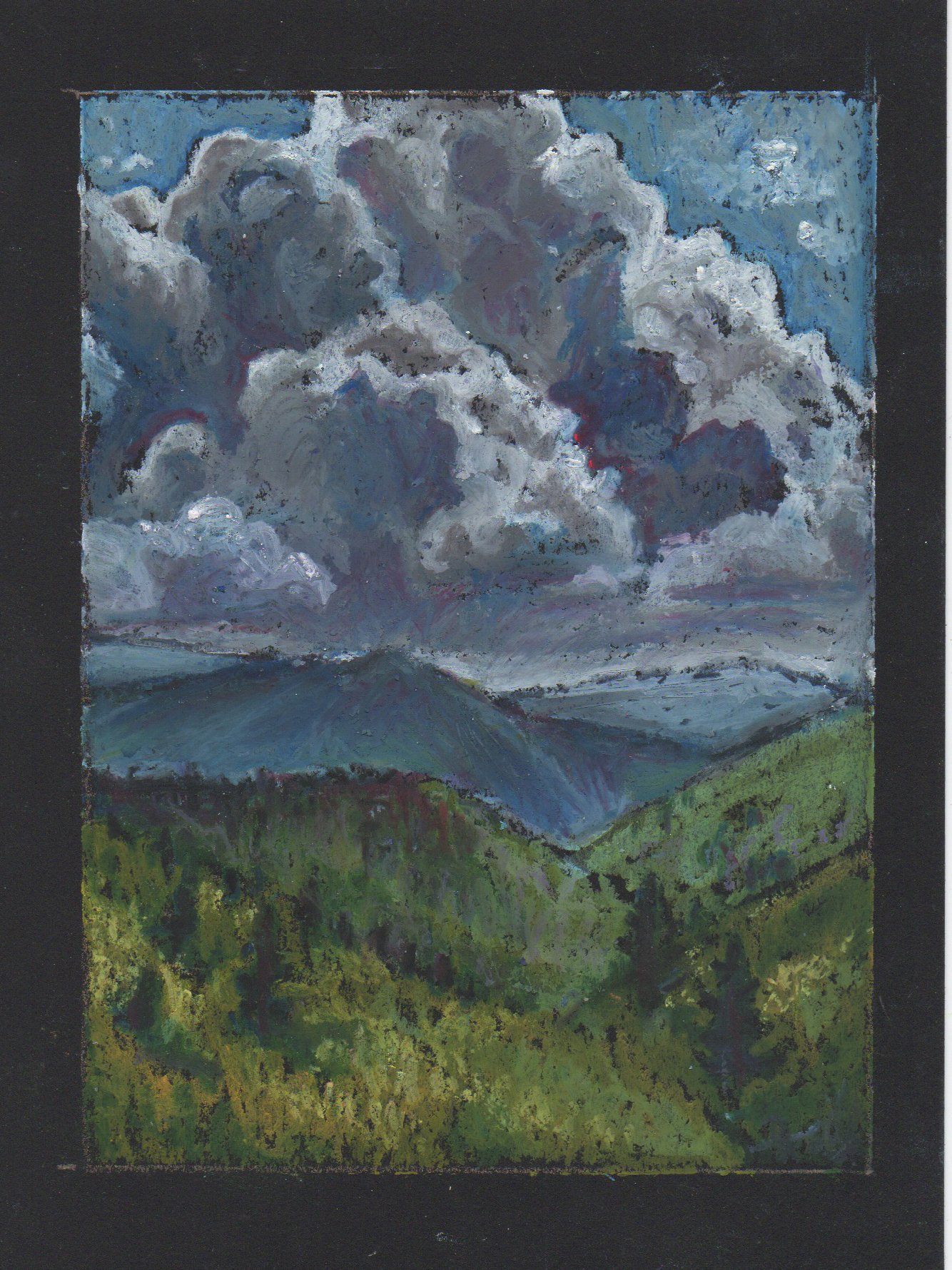
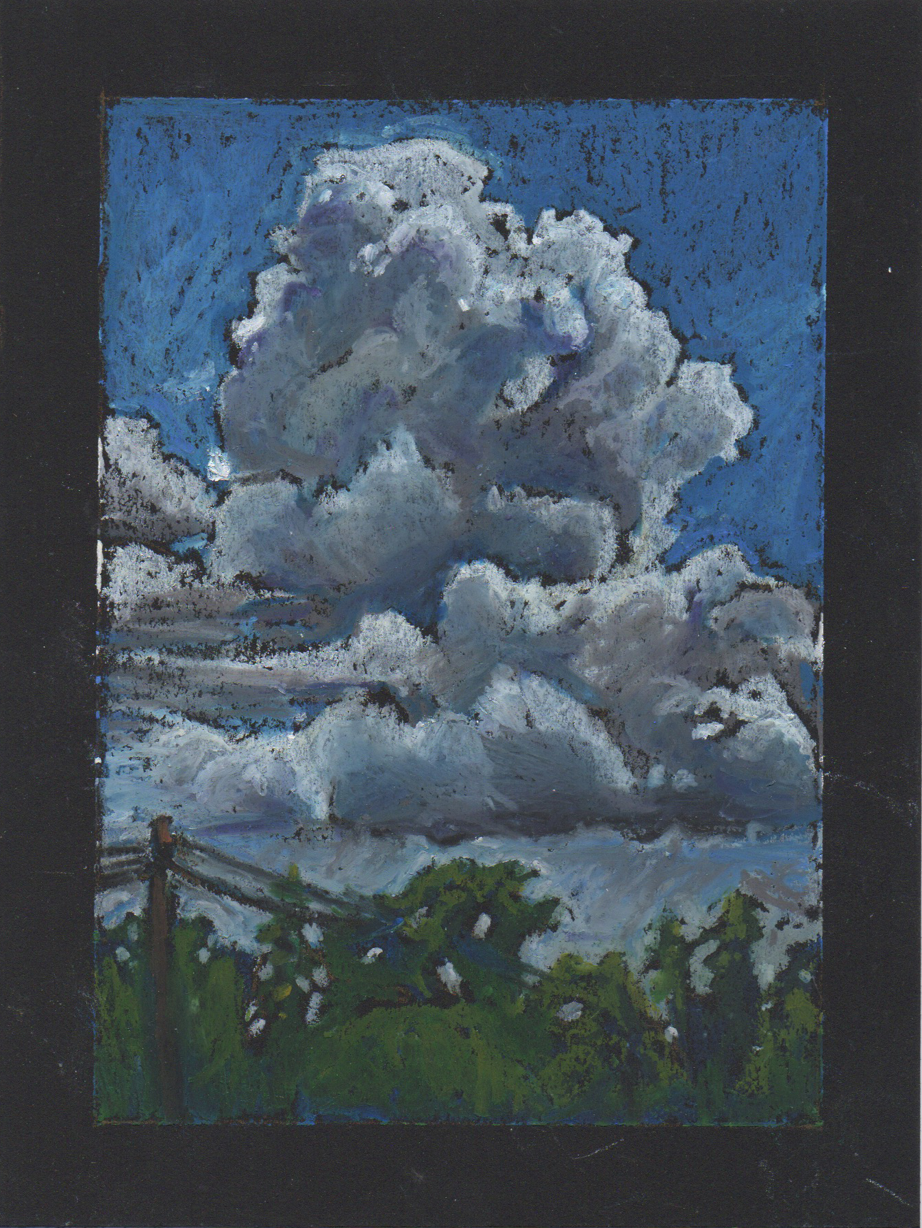
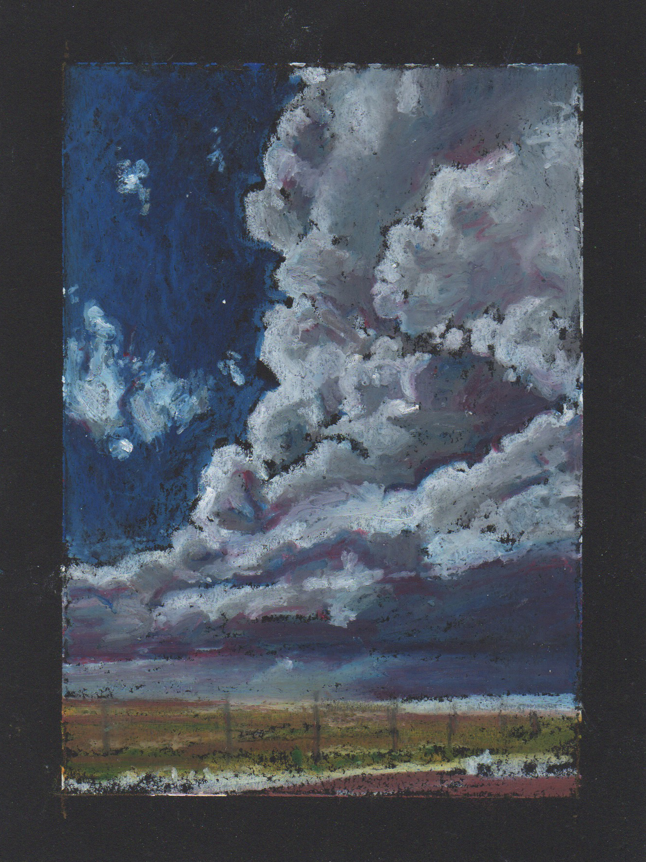
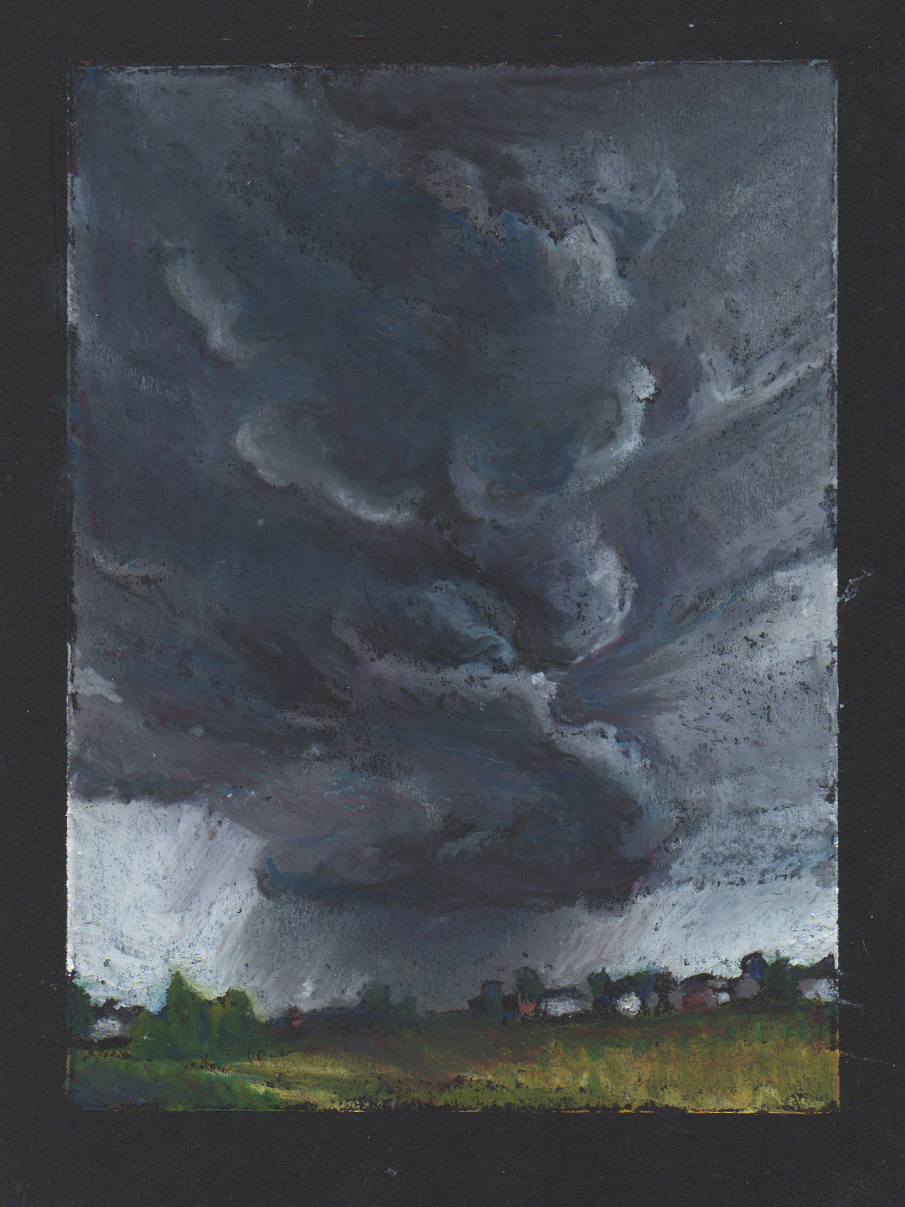
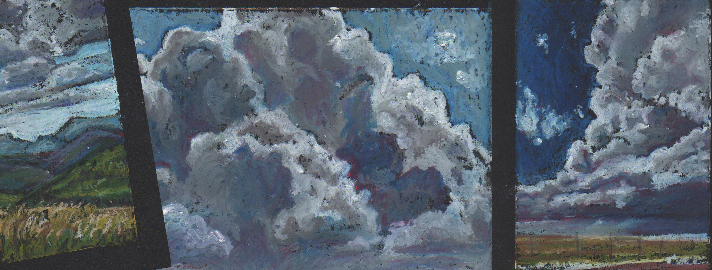
It may not seem like it, but I DO paint things other than birds and wildlife. In fact, until recent years I almost exclusively worked in portraits or figurative work. I really can’t explain the shift, except with the notion that change is the nature of life. I recently took a short break from wildlife to create a mini landscape in a vertical orientation. Something quick, something different, something filling. I became addicted to working in the narrow framing of a vast scene and on the bite size canvas that forced expressive strokes and letting go of detail. Within the week I had a pile of mini landscapes.
Beyond Wildlife
A Series of Mini Oil Pastel Landscapes
It may not seem like it, but I DO paint things other than birds and wildlife. In fact, until recent years I almost exclusively worked in portraits or figurative work. I really can’t explain the shift, except with the notion that change is the nature of life. I recently took a short break from wildlife to create a mini landscape in a vertical orientation. Something quick, something different, something filling. I became addicted to working in the narrow framing of a vast scene and on the bite size canvas that forced expressive strokes and letting go of detail. Within the week I had a pile of mini landscapes.
As the series evolved, I began to be more and more obsessed with the skies than the land, skyscapes of large billowing storm clouds. Maybe it was because I was stormy. Not stormy in the dark and somber sense, maybe on some days, but in the all of the multitudinous personalities of a storm. The tension of something building in the distance, the beauty of wild freedom, the smell of rain-soaked earth, the comfort of standing in the rain. For a days all I could think about was storm clouds. Gray masses blanketing the sky, ominous dark towers, fluffs building in the distance.
As quickly as it began, the sky reappeared and it was back to business as usual, birds, bees and beetles.
Mini Landscape Series: Numbers One through Eight