How to: Expressive Oil Pastel Illustrations (in the Style of the Children's Book Little Birder)
How To: Expressive Oil Pastel Illustrations
(in the Style of my Children’s Book)


This post may contain affiliate links. If you use these links to buy something I may earn a commission at no additional cost to you that allows me to continue to provide useful content. Thanks.
Do you want to use oil pastels but don’t know where to start? In this tutorial I will walk you through the steps to illustrate an oil pastel bird (or any subject matter) in the style of my children’s book “Little Birder: A Field Guide to Birds of the Alphabet”. This stye is bright and impactful and makes the most of oil pastel’s appealing qualities, but it does not require perfection or years of mastery and can be painted in a relatively short time.
This is a great place to start your oil pastel journey or continue to develop your own style using the versatile medium of oil pastels.


Supplies
Oil Pastels ( I enjoy this Pentel set or this Sakura set)
Pencil & eraser
Optional:
Washi, Masking, or painter's tape
Drawing board or cardboard backing
Hand warmers- for those of you who are painting your bird outside in freezing weather like me (I can’t recommend it.)
*As an Amazon Associate I earn from qualifying purchases.
Getting Started

To get started, I always tape the edges of my paper. This is optional, as you could also just illustrate all the way to the edge of your paper. It’s really a preference thing.
If you do tape, remember to lessen the stickiness of your painter’s tape, masking tape, or washi tape by sticking it to your pants a few times. This will help prevent the tape from tearing your paper when you remove it. *The longer your tape stays on, the more likely it is to damage your paper when it comes off. If you stop your work and come back, say… a month later, the tape will make some protests when you try to remove it.

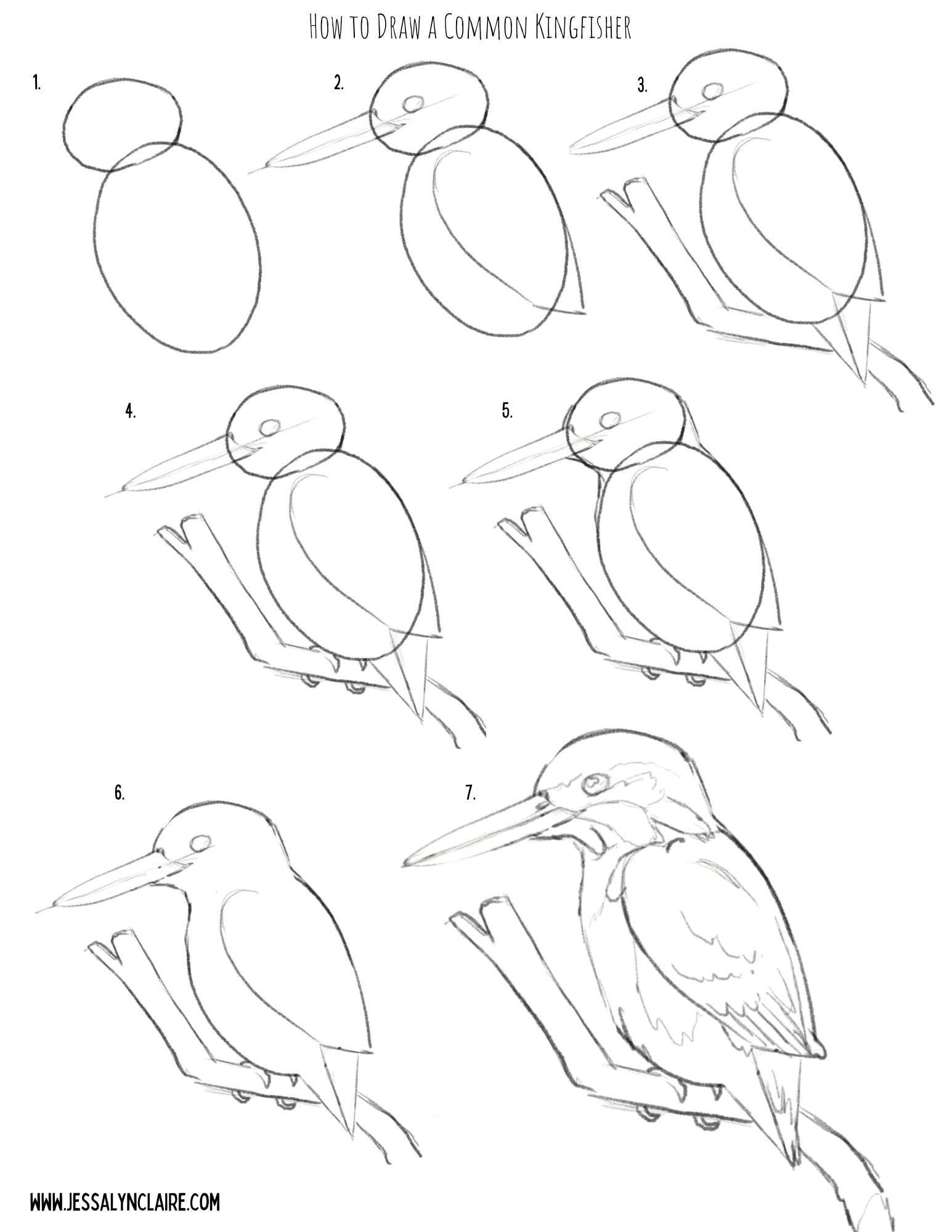
Sketch your composition
The next step will be to sketch your composition. I have provided a step by step illustration that you can use to practice your oil pastel artwork here, or you can create your own drawing.
Don’t worry about being cautious the pencil for your sketch, unlike other mediums the oil pastel will cover it and it does not stand out on the black paper.


Starting With Oil Pastels
For this tutorial I’ve chosen the Common Kingfisher because as mentioned, blues go down very opaque and bright on the black paper, requiring less experimenting to get the colors to show. However, it also has an area of orange, which is one of the colors that can require putting white down first before adding the color to create the opacity and vibrancy. This will allow us opportunity to discuss and practice both in our painting.
To begin the illustration, I begin with the main subject matter first. This is where I put most of my time into fine details. I focus my detail work on important areas like the face, eyes, etc. Use this to draw the viewers eye to the place in the work you want them to see most.
Notes about oil pastels on black paper:
Some colors go on more transparent and some more opaque.
The most opaque colors are white, blues, greens, pinks, some reds and purples, the light or pastel versions of all of the colors.
The most transparent colors are yellow & orange, some reds and purples, the darkest versions of all of the colors.
If you use white underneath one of the transparent colors it will show up more vibrantly as if it is opaque (but slightly more pastel in color).
Use the black paper to your advantage by let the black paper show through in places for the darkest areas and to create contrast.
Step by Step
STEP 1
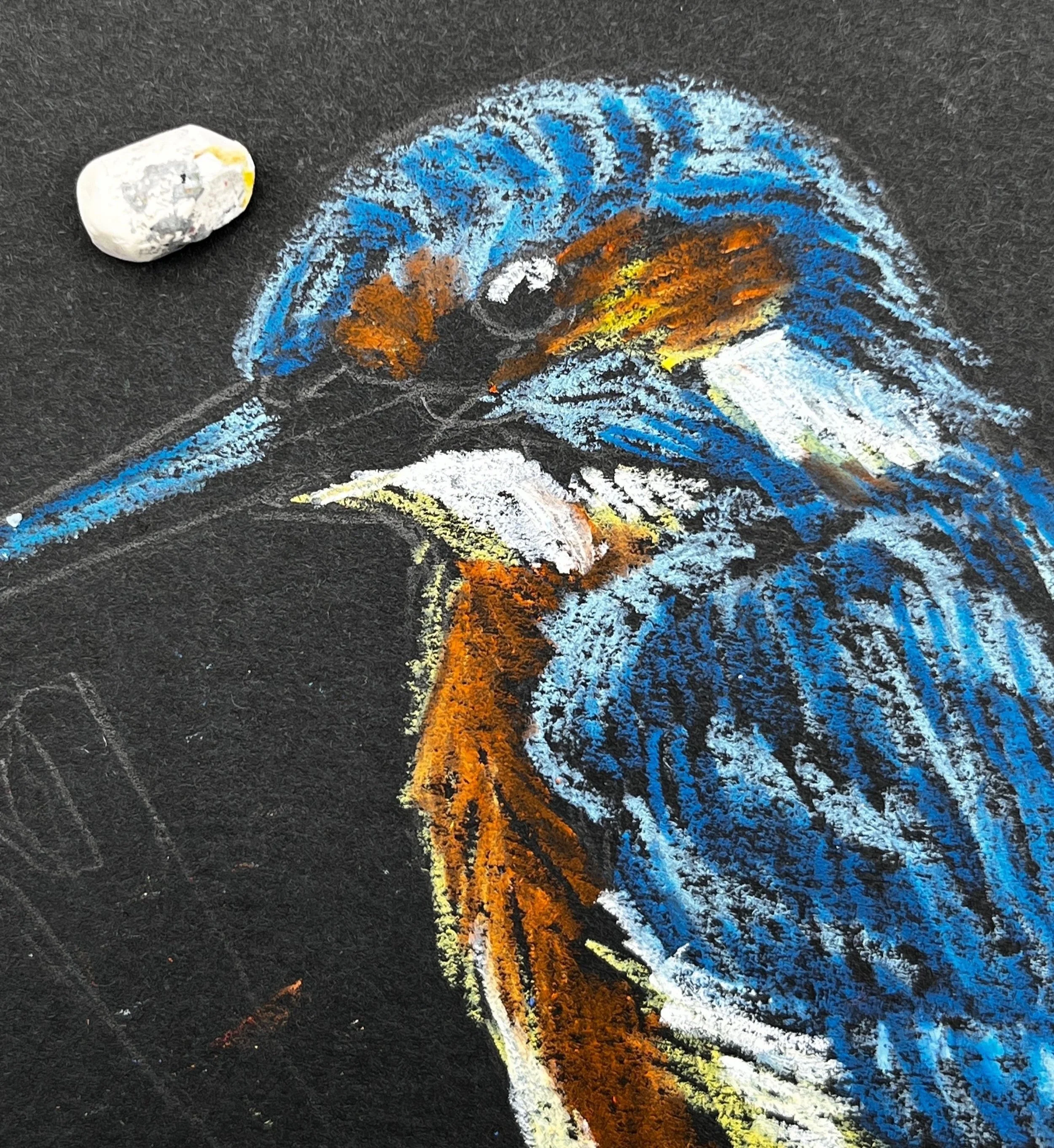
Starting with a light blue pastel. Block a thin layer into the areas of blue feathers on your kingfisher. You only need to start with a thin layer. The key to oil pastel is building up in layers, but adding more is easier than removing color from your work. So there is no rush to get thick pigment onto the paper. The point is to block in the light and dark shapes of color so you begin to see the shape form. There is no need to get overly detailed yet, but don’t be overly generic with laying down color either. Try to add your color in the direction of the feathers and pay attention to the shapes of the highlights.


STEP 2
2. Select a color that closely resembles the darker blue hues in the bird and begin the same process, adding marks in the direction of the feathers. Apply it thicker in areas that will become even darker as you progress. Tip: The light blue applies the same principles as the white. Because of its lightness and opacity you can apply it beneath the darker blue to intensify the colors. It is not necessary with the blue hues, and I like to mark in the various shades of blue as they are to give myself the ability to begin to see the shape and structure appear. Keeping this in mind though, it is okay to apply the light blue liberally underneath, as it will blend with the darker hues that are applied on top.


STEP 3
3. Next, referring to the chart above, decide how you will apply the yellows and orange hues, still following the same process as the light and darker blues where lighter colors are applied first and attention is paid to the broad shapes of color. Begin with the lightest yellow or white. I use a pastel yellow because it behaves similar to a white underneath the following layers, but it still adds the warmth and hue of the yellow. If you do not have this pastel, I recommend a very thin layer of white underneath. Mark first the light highlight areas and then follow with the orange hues.


STEP 4
4. Unlike in other mediums, white oil pastels can be applied over other colors that are darker, though it will not always completely cover the color beneath it. This ability is because of its thickness and opacity. This means, that unless you are applying white down before applying a transparent color, you do not have to start with the white areas first, but we will begin working from lighter versions of color, and move darker. Since this Kingfisher has bright white areas, treat them as you have the other shapes of color. They are solid white so you do not have to layer lightly. Simply press harder and take a single pass. Also add in some specks of white for the reflection in the eye and lighten the top of the bill. With both of these areas you can use the black pastel at the end of your artwork to correct any mistakes so just attempt these details with any tip or edge you can find on your white pastel.


STEP 5
5. Next I go over the areas where I have already laid down a layer of color. For the orange chest area, I looked closely at the areas of light and dark within the orange and applied another layer of one, or both of the oil pastels I used previously. Before applying another layer of orange, to brighten the dark areas of orange pastel I very lightly applied a stroke or two of the pastel yellow. In this case it does not color the area, but it adds enough oil and pigment to give the orange pastel something to blend with and creates less transparency. The opaque color will also make the orange more vibrant. If you look closely within each color you will see lots of variation of shades. Squint your eyes and try to focus on the large areas of light and dark that you see left.

STEP 6
6. From here you can continue to go back and forth, layering the pigments up. Add light blue back on top in areas to create the suggestion of the patterns in the feathers. You will know you are getting close to where you want it to be when you start seeing areas of the painting blending and appearing more like paint than crayon. However, it is okay to see some black paper coming through in some areas. Select the areas where you want the pastel layers to be dense, but don’t worry about getting rid of the paper completely. Always build up slowly and thoughtfully. Remember, you can add more easily than you can remove what you’ve already applied.


STEP 7
7. Select a color for the branch. I selected a medium gray and then applied the olive green that will be the background color to the underside. This gives the sense of a reflected light. You do not have to be as careful or slow in building up the color on the branch. You can now blend a small amount of black into some lower areas to create shadow and white on the top edge, or you can wait to do it closer to the end.


STEP 8
8.At this point I begin the background. First I trace around the image leaving a black border between the background and the subject matter. This is my stylistic preference and is optional. Apply the background very loosely, leaving some of the black paper coming through. In order to do this well, you will apply the oil pastel with firmer pressure so that each stroke solidly covers the paper. This prevents the need to make multiple passes.


STEP 9
9. The last step is to touch up with the black pastel. First I apply it into the eye and on the beak. If you accidentally cover the white spots, don’t fret. You can simply come back and press your white pastel onto the spot again and leave another white dot on top. I blend a small amount of black into the darkest shadow areas in the blue feathers to create more contrast. I do not always add black to the black borders around the subject, but I do when I need to clean something up and create a sharper edge.

STEP 10
10. Remove the tape. Tip: To prevent damage to your paper, pull the tape very slowly and angled out rather than straight down. Don’t forget to sign your work!


That’s it! Did you find yourself enjoying the freedom of imperfection? If you have questions or comments be sure to leave them below.