Recent Blog Posts


All Blog Posts
Looking for something specific? Try searching here.

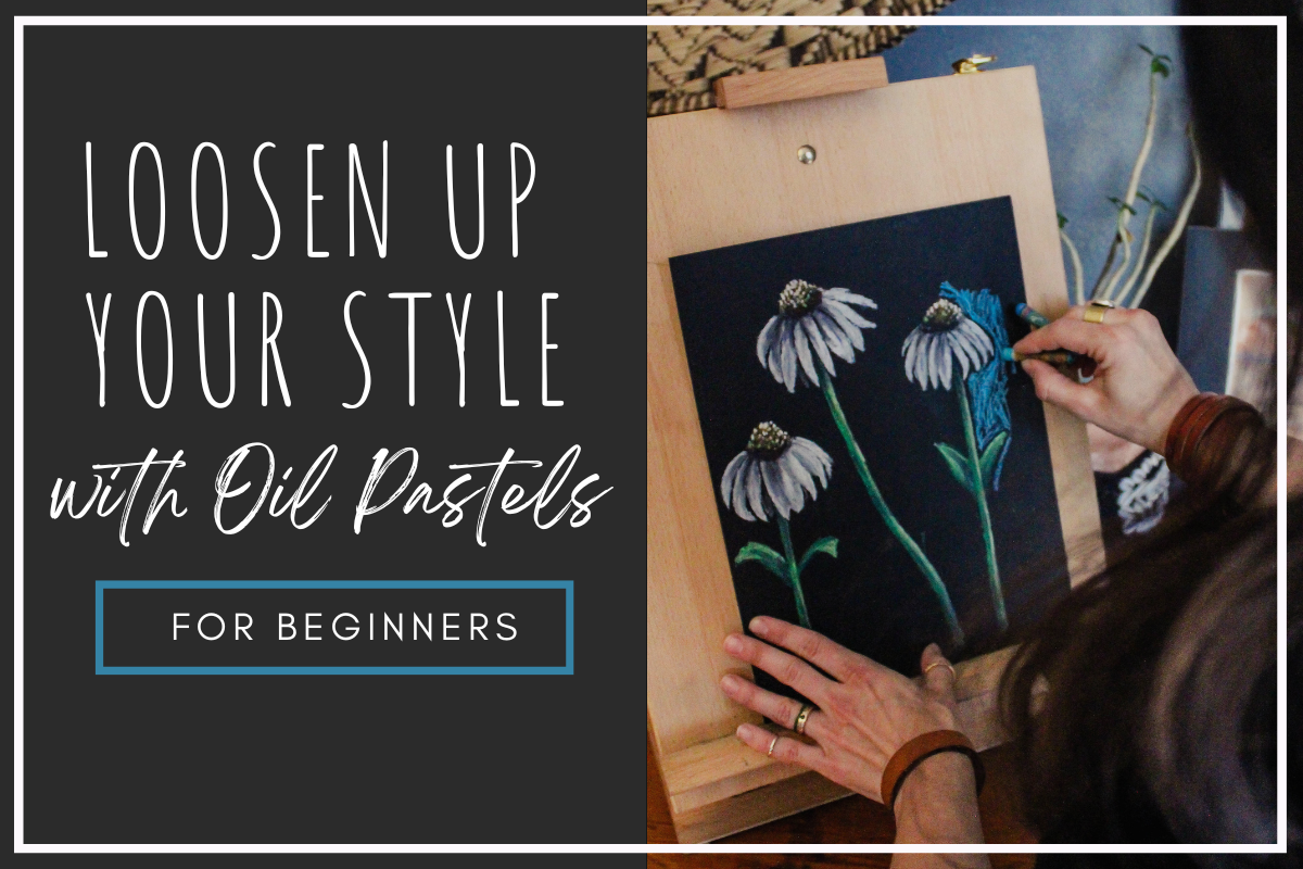
How to: Expressive Oil Pastel Illustrations (in the Style of the Children's Book Little Birder)
Do you want to use oil pastels but don’t know where to start? In this tutorial I will walk you through the steps to illustrate an oil pastel bird (or any subject matter) in the style of my children’s book “Little Birder: A Field Guide to Birds of the Alphabet”. This stye is bright and impactful and makes the most of oil pastel’s appealing qualities, but it does not require perfection or years of mastery and can be painted in a relatively short time.
This is a great place to start your oil pastel journey or continue to develop your own style using the versatile medium of oil pastels.
How To: Expressive Oil Pastel Illustrations
(in the Style of my Children’s Book)


This post may contain affiliate links. If you use these links to buy something I may earn a commission at no additional cost to you that allows me to continue to provide useful content. Thanks.
Do you want to use oil pastels but don’t know where to start? In this tutorial I will walk you through the steps to illustrate an oil pastel bird (or any subject matter) in the style of my children’s book “Little Birder: A Field Guide to Birds of the Alphabet”. This stye is bright and impactful and makes the most of oil pastel’s appealing qualities, but it does not require perfection or years of mastery and can be painted in a relatively short time.
This is a great place to start your oil pastel journey or continue to develop your own style using the versatile medium of oil pastels.


Supplies
Oil Pastels ( I enjoy this Pentel set or this Sakura set)
Pencil & eraser
Optional:
Washi, Masking, or painter's tape
Drawing board or cardboard backing
Hand warmers- for those of you who are painting your bird outside in freezing weather like me (I can’t recommend it.)
*As an Amazon Associate I earn from qualifying purchases.
Getting Started

To get started, I always tape the edges of my paper. This is optional, as you could also just illustrate all the way to the edge of your paper. It’s really a preference thing.
If you do tape, remember to lessen the stickiness of your painter’s tape, masking tape, or washi tape by sticking it to your pants a few times. This will help prevent the tape from tearing your paper when you remove it. *The longer your tape stays on, the more likely it is to damage your paper when it comes off. If you stop your work and come back, say… a month later, the tape will make some protests when you try to remove it.

Sketch your composition
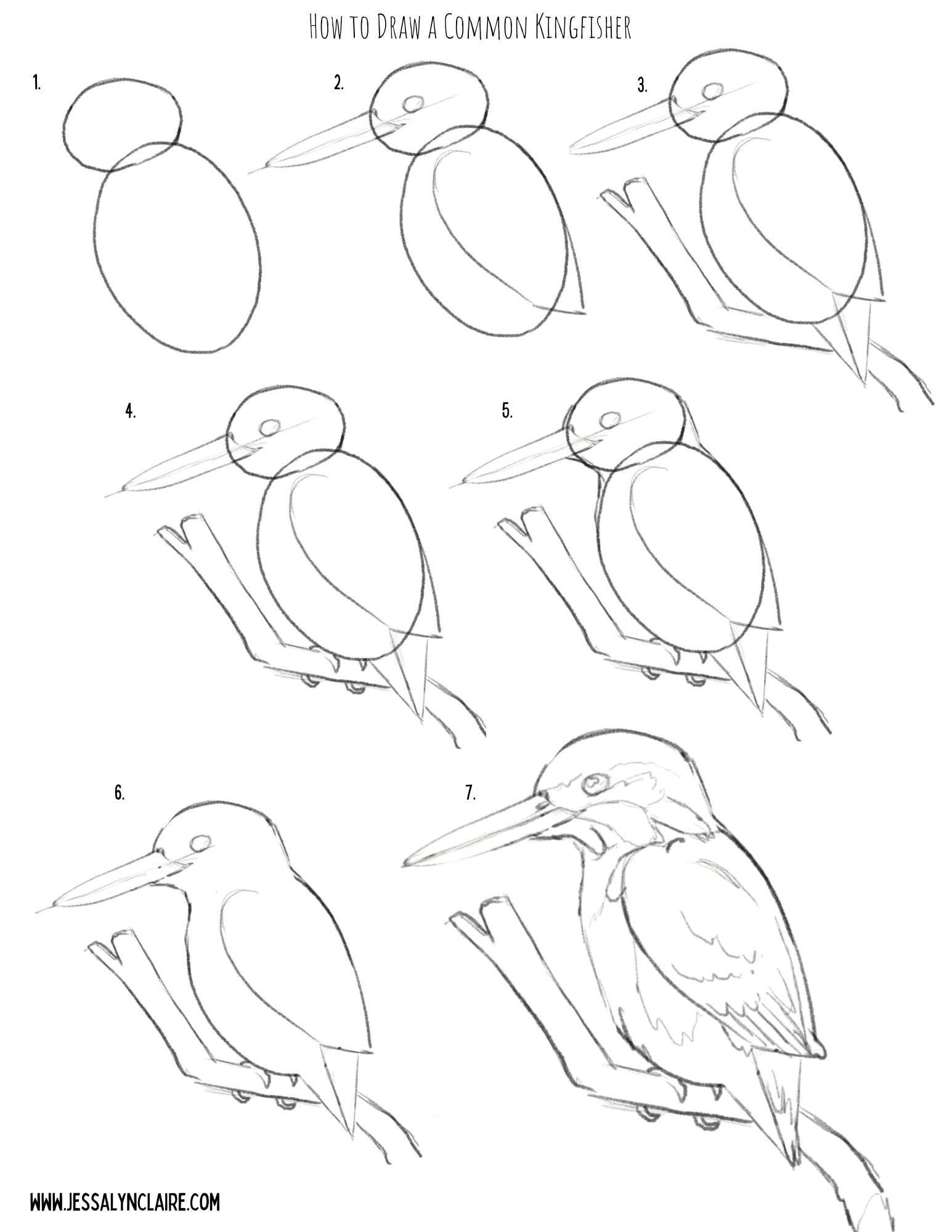
The next step will be to sketch your composition. I have provided a step by step illustration that you can use to practice your oil pastel artwork here, or you can create your own drawing.
Don’t worry about being cautious the pencil for your sketch, unlike other mediums the oil pastel will cover it and it does not stand out on the black paper.


Starting With Oil Pastels
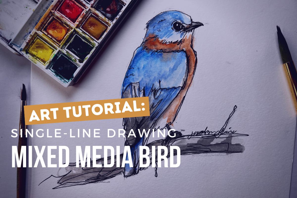
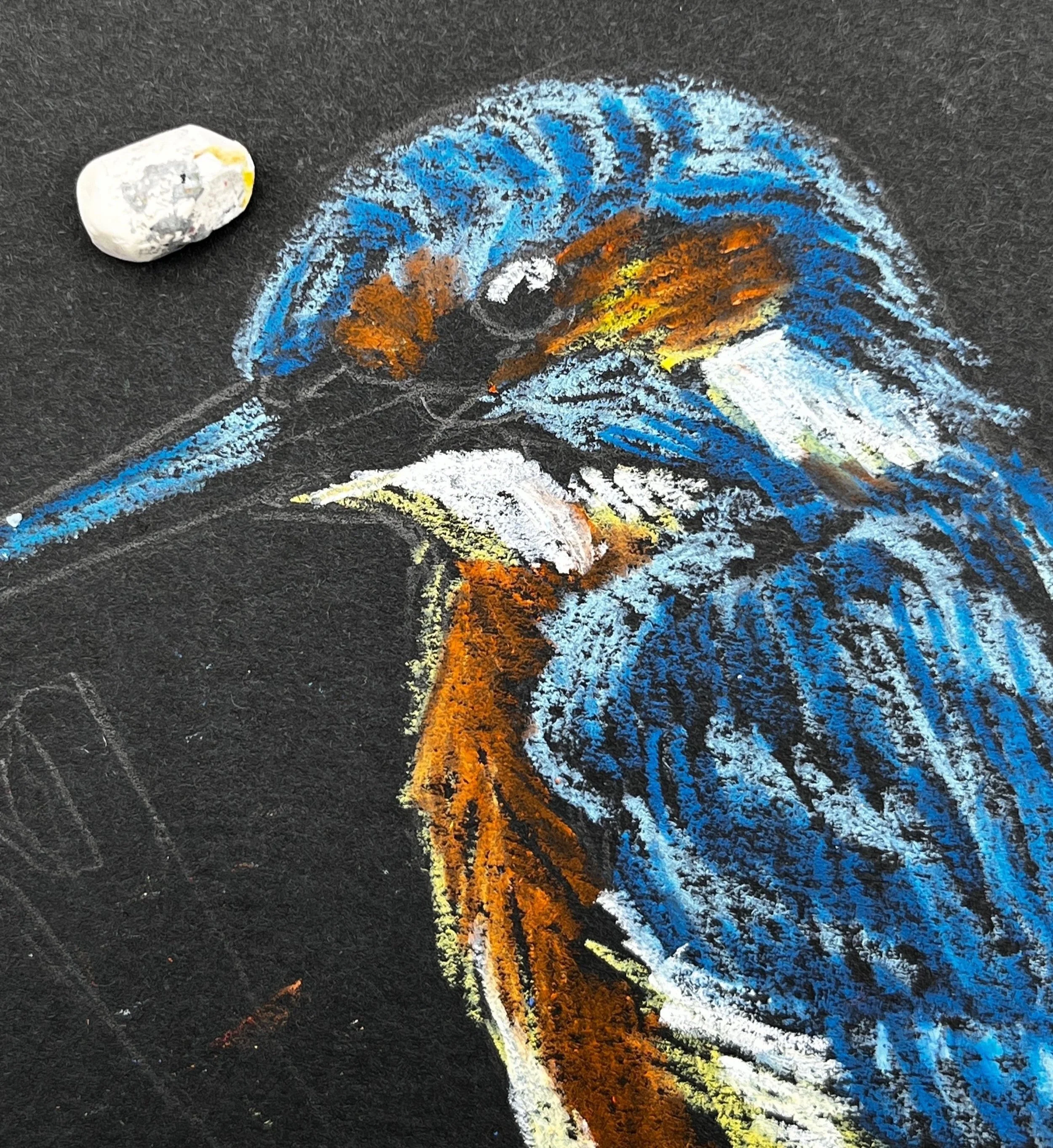
For this tutorial I’ve chosen the Common Kingfisher because as mentioned, blues go down very opaque and bright on the black paper, requiring less experimenting to get the colors to show. However, it also has an area of orange, which is one of the colors that can require putting white down first before adding the color to create the opacity and vibrancy. This will allow us opportunity to discuss and practice both in our painting.
To begin the illustration, I begin with the main subject matter first. This is where I put most of my time into fine details. I focus my detail work on important areas like the face, eyes, etc. Use this to draw the viewers eye to the place in the work you want them to see most.
Notes about oil pastels on black paper:
Some colors go on more transparent and some more opaque.
The most opaque colors are white, blues, greens, pinks, some reds and purples, the light or pastel versions of all of the colors.
The most transparent colors are yellow & orange, some reds and purples, the darkest versions of all of the colors.
If you use white underneath one of the transparent colors it will show up more vibrantly as if it is opaque (but slightly more pastel in color).
Use the black paper to your advantage by let the black paper show through in places for the darkest areas and to create contrast.
Step by Step
STEP 1
Starting with a light blue pastel. Block a thin layer into the areas of blue feathers on your kingfisher. You only need to start with a thin layer. The key to oil pastel is building up in layers, but adding more is easier than removing color from your work. So there is no rush to get thick pigment onto the paper. The point is to block in the light and dark shapes of color so you begin to see the shape form. There is no need to get overly detailed yet, but don’t be overly generic with laying down color either. Try to add your color in the direction of the feathers and pay attention to the shapes of the highlights.


STEP 2
2. Select a color that closely resembles the darker blue hues in the bird and begin the same process, adding marks in the direction of the feathers. Apply it thicker in areas that will become even darker as you progress. Tip: The light blue applies the same principles as the white. Because of its lightness and opacity you can apply it beneath the darker blue to intensify the colors. It is not necessary with the blue hues, and I like to mark in the various shades of blue as they are to give myself the ability to begin to see the shape and structure appear. Keeping this in mind though, it is okay to apply the light blue liberally underneath, as it will blend with the darker hues that are applied on top.


STEP 3
3. Next, referring to the chart above, decide how you will apply the yellows and orange hues, still following the same process as the light and darker blues where lighter colors are applied first and attention is paid to the broad shapes of color. Begin with the lightest yellow or white. I use a pastel yellow because it behaves similar to a white underneath the following layers, but it still adds the warmth and hue of the yellow. If you do not have this pastel, I recommend a very thin layer of white underneath. Mark first the light highlight areas and then follow with the orange hues.


STEP 4
4. Unlike in other mediums, white oil pastels can be applied over other colors that are darker, though it will not always completely cover the color beneath it. This ability is because of its thickness and opacity. This means, that unless you are applying white down before applying a transparent color, you do not have to start with the white areas first, but we will begin working from lighter versions of color, and move darker. Since this Kingfisher has bright white areas, treat them as you have the other shapes of color. They are solid white so you do not have to layer lightly. Simply press harder and take a single pass. Also add in some specks of white for the reflection in the eye and lighten the top of the bill. With both of these areas you can use the black pastel at the end of your artwork to correct any mistakes so just attempt these details with any tip or edge you can find on your white pastel.


STEP 5
5. Next I go over the areas where I have already laid down a layer of color. For the orange chest area, I looked closely at the areas of light and dark within the orange and applied another layer of one, or both of the oil pastels I used previously. Before applying another layer of orange, to brighten the dark areas of orange pastel I very lightly applied a stroke or two of the pastel yellow. In this case it does not color the area, but it adds enough oil and pigment to give the orange pastel something to blend with and creates less transparency. The opaque color will also make the orange more vibrant. If you look closely within each color you will see lots of variation of shades. Squint your eyes and try to focus on the large areas of light and dark that you see left.

STEP 6
6. From here you can continue to go back and forth, layering the pigments up. Add light blue back on top in areas to create the suggestion of the patterns in the feathers. You will know you are getting close to where you want it to be when you start seeing areas of the painting blending and appearing more like paint than crayon. However, it is okay to see some black paper coming through in some areas. Select the areas where you want the pastel layers to be dense, but don’t worry about getting rid of the paper completely. Always build up slowly and thoughtfully. Remember, you can add more easily than you can remove what you’ve already applied.


STEP 7
7. Select a color for the branch. I selected a medium gray and then applied the olive green that will be the background color to the underside. This gives the sense of a reflected light. You do not have to be as careful or slow in building up the color on the branch. You can now blend a small amount of black into some lower areas to create shadow and white on the top edge, or you can wait to do it closer to the end.


STEP 8
8.At this point I begin the background. First I trace around the image leaving a black border between the background and the subject matter. This is my stylistic preference and is optional. Apply the background very loosely, leaving some of the black paper coming through. In order to do this well, you will apply the oil pastel with firmer pressure so that each stroke solidly covers the paper. This prevents the need to make multiple passes.


STEP 9
9. The last step is to touch up with the black pastel. First I apply it into the eye and on the beak. If you accidentally cover the white spots, don’t fret. You can simply come back and press your white pastel onto the spot again and leave another white dot on top. I blend a small amount of black into the darkest shadow areas in the blue feathers to create more contrast. I do not always add black to the black borders around the subject, but I do when I need to clean something up and create a sharper edge.

STEP 10
10. Remove the tape. Tip: To prevent damage to your paper, pull the tape very slowly and angled out rather than straight down. Don’t forget to sign your work!


That’s it! Did you find yourself enjoying the freedom of imperfection? If you have questions or comments be sure to leave them below.


Free Art Class for Kids | How to Draw Realistic Birds on Outschool - Part One
Do you have a child that wants to be an artist or learn to draw? In this post I share the first video from week one of my How to Draw Realistic Birds (and Think Like an Artist) class on Outschool.com
Keep reading to learn more about learning on Outschool and find the free learning video.
want a FREE DRAWING LESSON? Find the video below.
Do you have a child that wants to be an artist or learn to draw? In this post I share the first video from week one of my How to Draw Realistic Birds (and Think Like an Artist) class on Outschool.com
Keep reading to learn more about learning on Outschool and find the free learning video.
Not everything that changed in the pandemic era is for the worse. (I mean, a lot of it was pretty awful, let’s not let that go too easily.) However, one of the most interesting, if not most important, changes that we have seen is the shift toward online distance-learning. The world that was already at our fingertips through the internet, is now the world of knowledge to be learned from the comfort of our own home and the convenience of our own time-zone… and it is pretty awesome.
THE SILVER LINING
There are significant downsides to children attending kindergarten from a screen at home, and yet there is also a silver-lining in the situation. That is, we’ve realized that if our kids can learn how to multiply from their local math teachers from the living room couch, then why can’t they learn to draw, code websites, bake, dance, speak a new language, make origami, or whatever their little hearts desire to know too? That is where platforms like Outschool come in. Outschool boasts of 140,000 classes to choose from for ages 3-18. Outschool has multiple formats for classes in core subjects like math, science and history, but it also has offerings of art, hobbies and just about any subject you can dream up. Outschool focuses on small-group, interactive experiences that take place live, but there are also opportunities to learn without a live meeting.
Let’s learn a little more about Outschool before moving on to the FREE part-one video lesson from the first week of my class How to Draw Realistic Birds (and Think like an Artist)
What is Outschool?
Outschool is an education platform that offers online classes for kids ages 3-18. Unlike traditional classes, Outschool classes let kids explore their interests with live Zoom classes taught by experienced, independent educators.
What kind of classes are on Outschool?
Live classes- Live classes meet over video chat in the classroom for the schedule timed. This format is just like any online class scenario that we have come to know.
FLEX Classes - While the vast majority of Outschool classes feature scheduled, live meetings using the video classroom, it also offers the option of flexible schedule (“flex”) classes, which don’t rely on live meetings. In a Flex Class format, teachers conduct the class by posting videos in the Outschool classroom and engaging with learners asynchronously. Flex classes run for a minimum of four weeks.
What are the options for class length on Outschool?
One-time Classes- These are classes that meet only once. They can be a great option for filling in a school holiday, or a last minute Saturday activity. (Yes, there are tons of classes that happen on the weekends.)
Multi-Day Classes- These are classes that meet more than once. This can range from two meetings all the way up to a semester class. Multi-day classes that meet more than once in a week are considered camps.
Ongoing Classes- Ongoing classes meet weekly and do not have a set start or end date. Sign up for ongoing classes similar to a subscription. Any time you need to miss a week you can stop your subscription and re-enroll when you are ready to return. I like to call my ongoing art classes “clubs”, because students often stay together for long periods of time, allowing for familiarity between the students.
What size are the classes on Outschool?
Group Classes - Group classes on Outschool vary depending on the age range, but all group classes are capped at 18 learners.
1:1 Classes - 1:1 classes are private classes with the teacher and topic of your choosing. It is a great opportunity for affordable tutoring or 1:1 learning time that is tailored to your student. Interested in 1:1 art lessons? Find my classes here. (Available for ages 6-18)
Semi- Private - Many teachers offer semi-private lessons that provide the opportunity for lower cost classes that have the same personal interaction with your student as a private lesson.
Way to go! Now that you’ve learned how to see basic shapes for your sketch and draw what you see in front of you, click the button below to find the guided-drawing video of a Black-Capped Chickadee.
How to Draw Realistic Birds- Part Two- Final Drawing
Let’s pick up where we left off…
When I talk about the two different stages of a drawing, I will often refer to the sketch stage as the “thinking part” and the drawing stage as, “the artistic part”, because that is essentially what they are. The sketch is the stage of a drawing that forces you to slow down, use your brain as you measure and study and adjust until your drawing is as accurate as possible.

How to Draw Realistic Birds
Welcome back! Don’t forget to sign up to download the How to Draw Realistic Birds- Part Two PDF below.
This post may contain affiliate links. If you use these links to buy something I may earn a commission at no additional cost to you. Thanks.
Part Two- Final Drawing
Welcome to the second part of the How to Draw Realistic Birds tutorial. In part one, we learned how to see and use basic shapes to create a sketch that will be the foundation of our drawing. In this post, we will move on to the “artistic” part of our drawing, and let’s be honest— the part we all came for.
Let’s pick up where we left off…
When I talk about the two different stages of a drawing, I will often refer to the sketch stage as the “thinking part” and the drawing stage as, “the artistic part”, because that is essentially what they are. The sketch is the stage of a drawing that forces you to slow down, use your brain as you measure and study and adjust until your drawing is as accurate as possible.
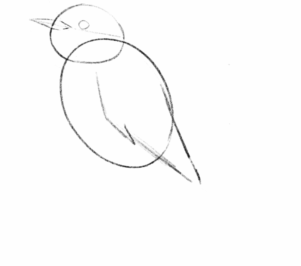
The second stage is the stage of adding shading and details that make it come to life. Before we fully move on, have you adjusted your outline and erased the leftover shapes from our very first few marks? Don’t move on to your shading and details until you’ve checked the shape around the head and neck, checked to see if any of your proportions need adjusting… make any changes that you notice need to be made at this stage. They are harder to adjust later on.

Shading & Details
Shading Practice
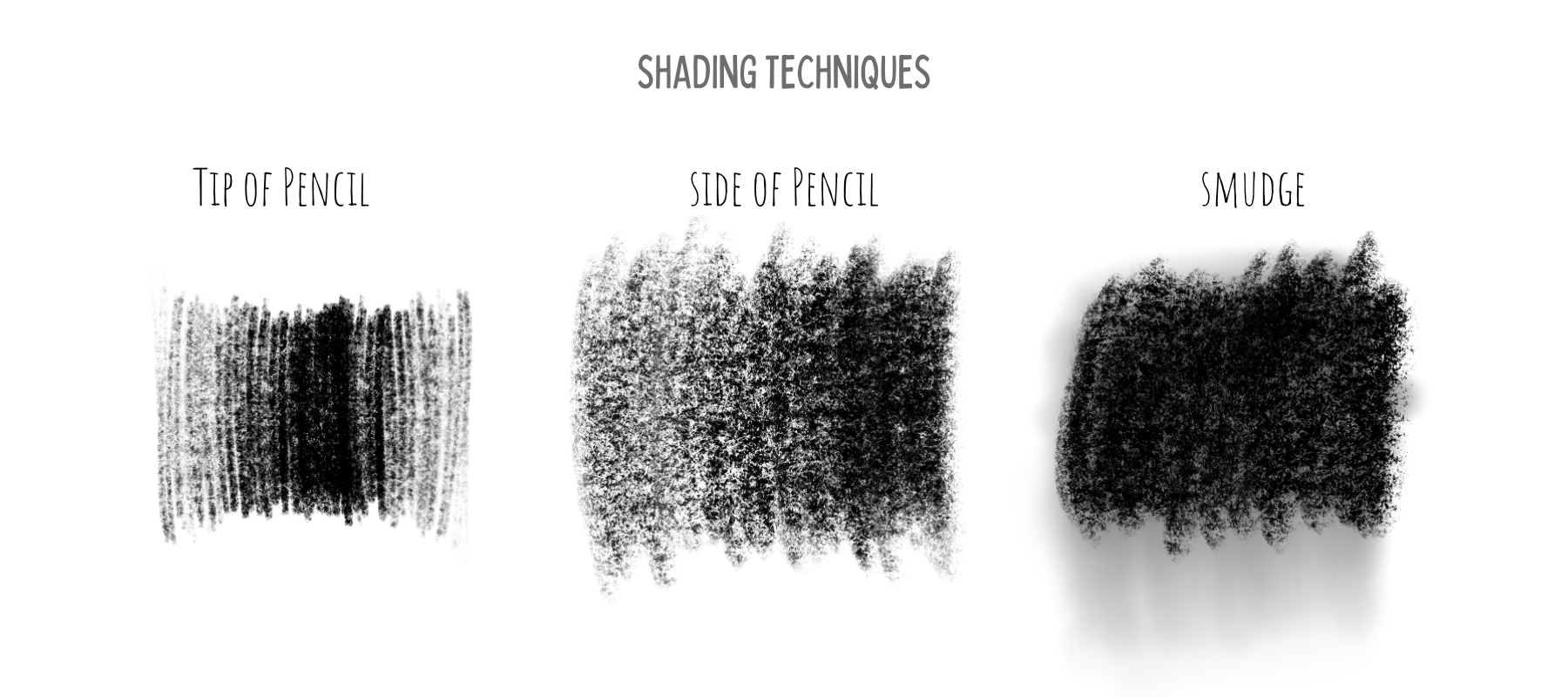
I like to make a few notes about the techniques of shading before we get into the process.
Shading with the tip of your pencil: I’m sure this is obvious, but one method of shading uses the pencil in the same position as when you write, where the tip of the pencil is touching the paper. It may be obvious, but that doesn’t make it easy. Smooth, controlled shading in this way is a skill that has to be developed and practiced. Use this method on a drawing that you plan to spend a lot of time completing (because it is slow), small areas of shading like the eye, and for texture marks.
Shading with the side of your pencil: Another option would be to grip your pencil slightly farther back toward the eraser and apply the graphite with the side of the pencil. Doing so applies the pencil in a softer and faster way. You are still able to create variations of dark and light by pressing harder or going over areas without as much time or delicacy. This is great for drawings which you do not intend to spend a long time completing.
Lastly, and this is somewhat contested among artists, but you can smooth and blend your shading by smudging. I do recommend practicing controlled shading, but it is your drawing. No one cares if you use your finger and soften up those shades. Blend areas of shading by rubbing in circular motions with your finger or tissue. You can even create a smooth gradient by smudging pencil into areas of the drawing that do not have any shading. Use this as a first layer to come back on top with texture or further shading.

Step one: creating contrast
Darkest and lightest areas

There are multiple ways you could go about the next few steps. For the sake of learning, there must be an order, but in your own practice it is more likely that you will find yourself switching between shading and details as it feels right. There is an intuition that you will develop for the process.
Because I believe in some instant gratification as motivation, I recommend starting the shading by finding the very darkest areas of the drawing as well as the lightest. The paper is most likely white and you cannot get whiter than the white of the paper, so in that case we simply leave out the areas of highlight. So those are already taken care of and all you need to do is find the darkest areas.
Squint your eyes at the reference photo. Doing so will take away detail and reveal to you larger shapes of various shades of color. Notice any areas that are so dark when you squint that you can more or less fill them in as dark as possible with your pencil. Some of these areas will not have sharp borders, but they will fade into lighter areas so you will also want to replicate this by fading those darkest areas. Some areas thought may have edges, like the eye.
2. The eye is my favorite place to start because it is quick and very gratifying. To shade in the eye, fill the eye in as dark as possible, but leave out a small organic shape, like a circle, the white of the paper. Even when I don’t see this reflection in the reference photo, I will still add it to the eye. This is because it taps into the way our brain processes shape. As artists, we are putting flat lines and shades onto a paper and attempting to make them look 3-dimensional. This one simple trick will instantly make the drawing look more realistic because the viewer’s brain will recognize it as the highlight that happens on a sphere with a light source. (Step 1. is the last step from the basic sketch.)
3. From here, shade the areas that you have deemed to be the darkest. Because they are areas to shade as densely as you can, you do not have to be quite as deliberate and slow as in areas that require more variation and attention to detail. Immediately, you will see a high contrast in the drawing. By doing this, the form will take shape and it also identifies a value range. By determining the outer limits of our values, it makes it easier to then see the middle values that fall between white and black, or those middle values that will require more deliberate shading (effort).
Step two: suggesting texture
Drawing Feathers
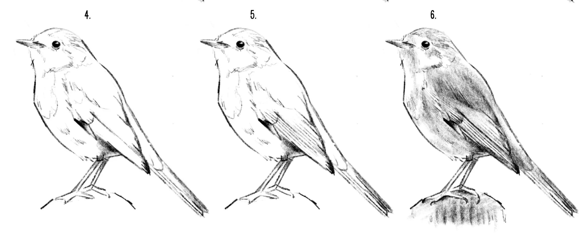
The shading is not complete, but before moving on, let’s take a look at suggesting texture, in this case- feathers.
Often, new artists or young artists will fall into the trap of drawing what they know is there whether they see it or not. A bird is covered in feathers, and most likely, you already know that. So your very intelligent machinery (brain) kicks in and says, “Great. Let’s cover this thing in feathers.” The result will look something like the photo below, and not very realistic. However, by zooming in very closely and tracing what we actually see… you can see clearly that even though there are feathers covering the bird, we do not actually see feathers. What we see are the SHADOWS of the upper layer of feathers being cast on the feathers below. And they often look like hash lines, v or w shapes, squiggles, dots— anything but feathers— but this IS what we see, so this is what you need to draw.
This is called “suggesting” feathers. That is because you are suggesting that they are there without drawing the feather shape. Similarly, you do not need to cover the entire drawing in these lines. You only need to add them to the key areas to suggest the texture. If you struggle to know where to add and where to leave them off, squint again to remove the detail and only add them in some of the areas where you still see the suggestion of them in the reference. You might often see these at the line where the head and body meet, the chest and belly area, and along fluffy edges of the outline.
Step three: Middle values and detail
You are now aware of the skills required to complete your drawing. It is time to go back and forth between these methods and practice your intuition. Look closely at the value in different areas on the body, filling in a smooth value of grey or dark grey in any area of shadow. Use your feather shadow marks to show texture or even to darken areas of shadow. Use light lines for texture in highlight areas and use heavy, dark lines for texture in areas of dark feathers or shadow.
Conclusion
An inspiring artist and naturalist, John Muir Laws, said, “Every drawing is practice for the next.” What he means by this is, if our primary focus each time is on the outcome of our drawing and whether we end with a pretty picture, then sometimes we will succeed but we will likely fail in equal proportion. In the journey toward becoming the artist you would like to be, there will be drawings that you do not enjoy when you are finished. Holding pretty outcomes as your highest aim makes you vulnerable to discouragement, and even vulnerable to giving up. However, if when you sit down to draw you are approaching it as if it is always practice for the next drawing that you do, then regardless of the final product you will have a successful drawing. Each time you intentionally put time and effort into your skill you WILL learn and gain something. You are literally creating new connections in your brain each time you exercise the effort of your skill.
So, more important than all, aim for discovery and get comfortable with the idea of imperfection. That will be your fastest road to art success.
Love all things birds and art?
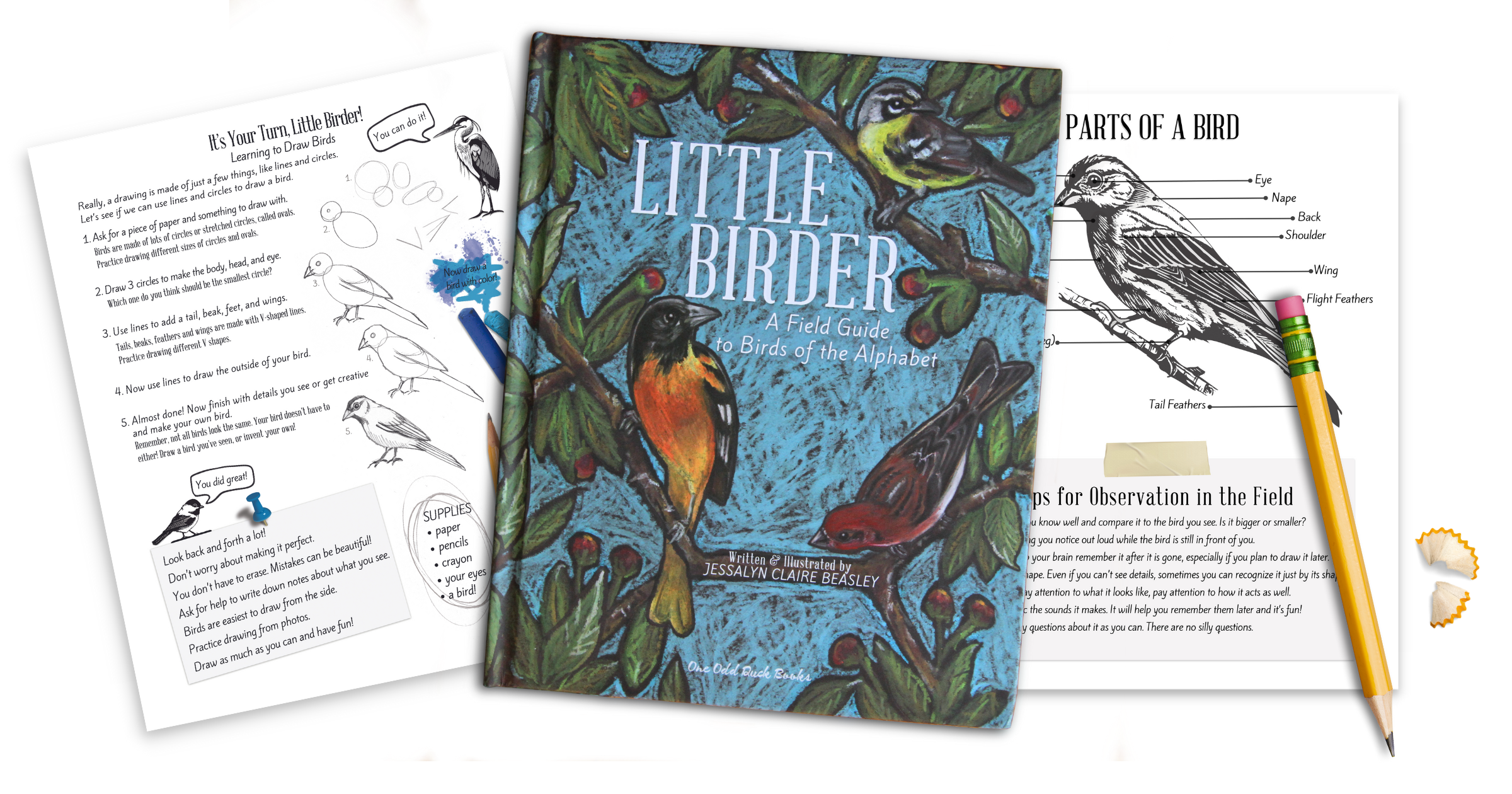
Click the image below to grab a copy of my children’s book, Little Birder: A Field Guide to Birds of the Alphabet.
Click here to read How to Draw Realistic Birds Part-One
