Recent Blog Posts


All Blog Posts
Looking for something specific? Try searching here.

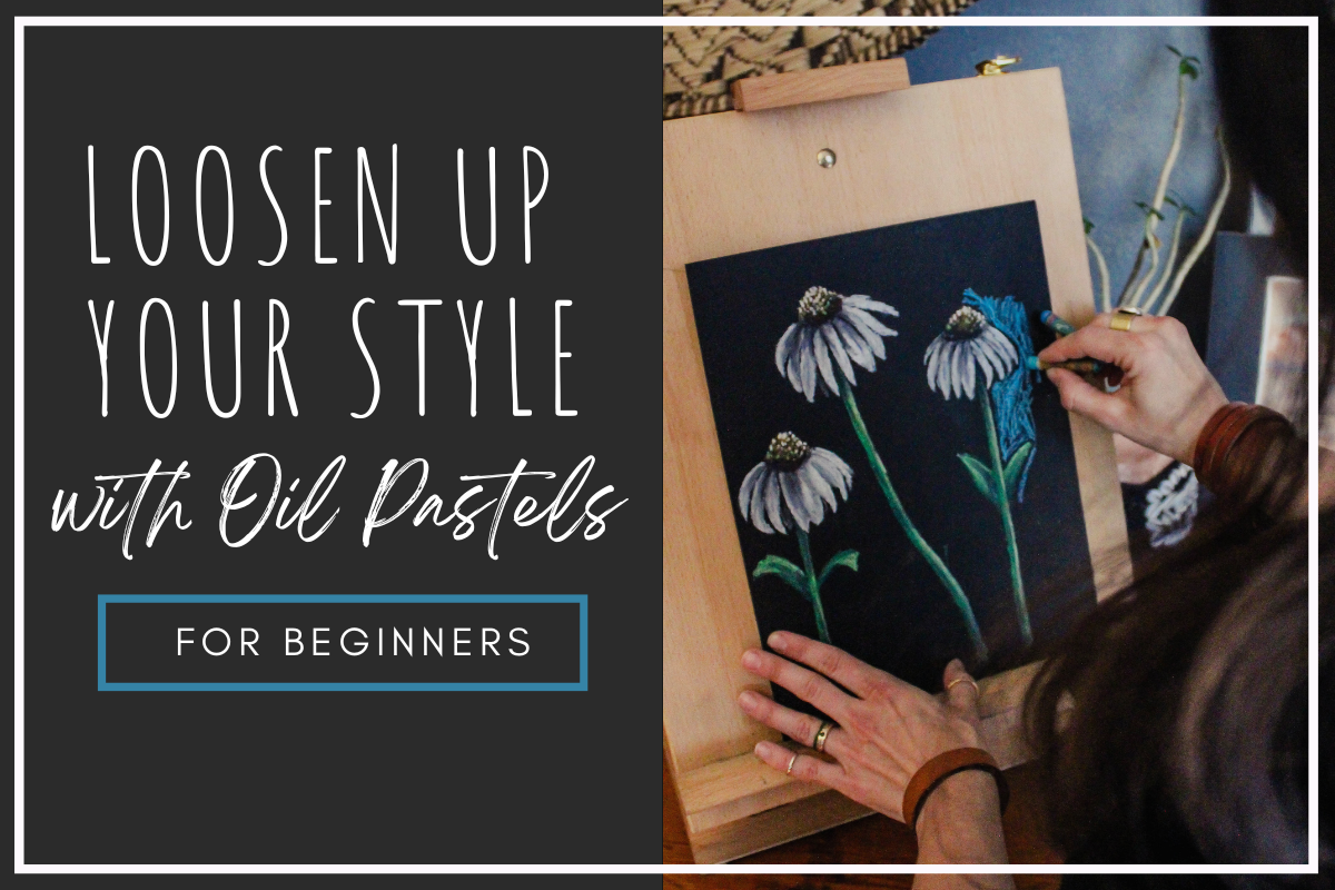
How to: Expressive Oil Pastel Illustrations (in the Style of the Children's Book Little Birder)
Do you want to use oil pastels but don’t know where to start? In this tutorial I will walk you through the steps to illustrate an oil pastel bird (or any subject matter) in the style of my children’s book “Little Birder: A Field Guide to Birds of the Alphabet”. This stye is bright and impactful and makes the most of oil pastel’s appealing qualities, but it does not require perfection or years of mastery and can be painted in a relatively short time.
This is a great place to start your oil pastel journey or continue to develop your own style using the versatile medium of oil pastels.
How To: Expressive Oil Pastel Illustrations
(in the Style of my Children’s Book)


This post may contain affiliate links. If you use these links to buy something I may earn a commission at no additional cost to you that allows me to continue to provide useful content. Thanks.
Do you want to use oil pastels but don’t know where to start? In this tutorial I will walk you through the steps to illustrate an oil pastel bird (or any subject matter) in the style of my children’s book “Little Birder: A Field Guide to Birds of the Alphabet”. This stye is bright and impactful and makes the most of oil pastel’s appealing qualities, but it does not require perfection or years of mastery and can be painted in a relatively short time.
This is a great place to start your oil pastel journey or continue to develop your own style using the versatile medium of oil pastels.


Supplies
Oil Pastels ( I enjoy this Pentel set or this Sakura set)
Pencil & eraser
Optional:
Washi, Masking, or painter's tape
Drawing board or cardboard backing
Hand warmers- for those of you who are painting your bird outside in freezing weather like me (I can’t recommend it.)
*As an Amazon Associate I earn from qualifying purchases.
Getting Started

To get started, I always tape the edges of my paper. This is optional, as you could also just illustrate all the way to the edge of your paper. It’s really a preference thing.
If you do tape, remember to lessen the stickiness of your painter’s tape, masking tape, or washi tape by sticking it to your pants a few times. This will help prevent the tape from tearing your paper when you remove it. *The longer your tape stays on, the more likely it is to damage your paper when it comes off. If you stop your work and come back, say… a month later, the tape will make some protests when you try to remove it.

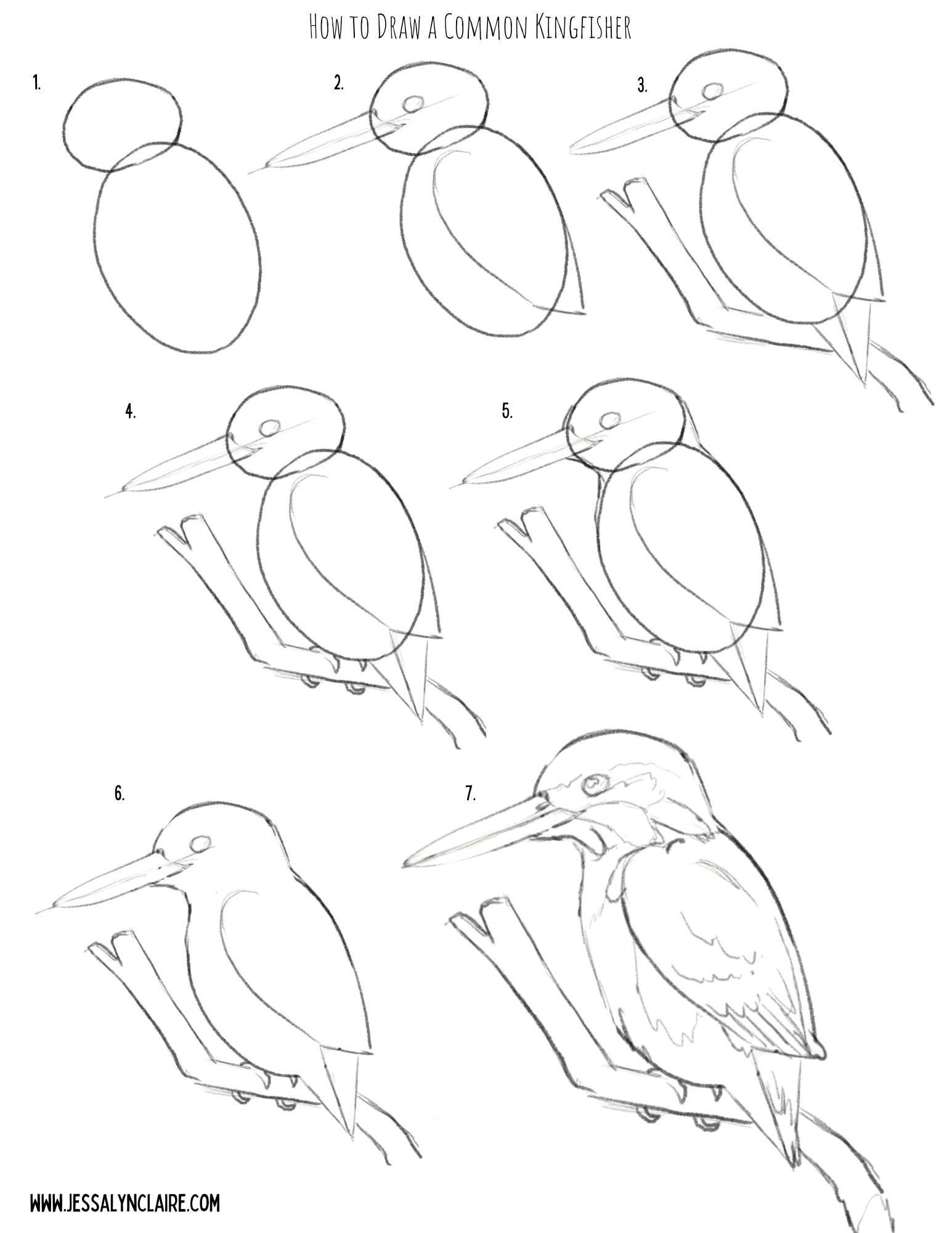
Sketch your composition
The next step will be to sketch your composition. I have provided a step by step illustration that you can use to practice your oil pastel artwork here, or you can create your own drawing.
Don’t worry about being cautious the pencil for your sketch, unlike other mediums the oil pastel will cover it and it does not stand out on the black paper.


Starting With Oil Pastels
For this tutorial I’ve chosen the Common Kingfisher because as mentioned, blues go down very opaque and bright on the black paper, requiring less experimenting to get the colors to show. However, it also has an area of orange, which is one of the colors that can require putting white down first before adding the color to create the opacity and vibrancy. This will allow us opportunity to discuss and practice both in our painting.
To begin the illustration, I begin with the main subject matter first. This is where I put most of my time into fine details. I focus my detail work on important areas like the face, eyes, etc. Use this to draw the viewers eye to the place in the work you want them to see most.
Notes about oil pastels on black paper:
Some colors go on more transparent and some more opaque.
The most opaque colors are white, blues, greens, pinks, some reds and purples, the light or pastel versions of all of the colors.
The most transparent colors are yellow & orange, some reds and purples, the darkest versions of all of the colors.
If you use white underneath one of the transparent colors it will show up more vibrantly as if it is opaque (but slightly more pastel in color).
Use the black paper to your advantage by let the black paper show through in places for the darkest areas and to create contrast.
Step by Step
STEP 1
Starting with a light blue pastel. Block a thin layer into the areas of blue feathers on your kingfisher. You only need to start with a thin layer. The key to oil pastel is building up in layers, but adding more is easier than removing color from your work. So there is no rush to get thick pigment onto the paper. The point is to block in the light and dark shapes of color so you begin to see the shape form. There is no need to get overly detailed yet, but don’t be overly generic with laying down color either. Try to add your color in the direction of the feathers and pay attention to the shapes of the highlights.


STEP 2
2. Select a color that closely resembles the darker blue hues in the bird and begin the same process, adding marks in the direction of the feathers. Apply it thicker in areas that will become even darker as you progress. Tip: The light blue applies the same principles as the white. Because of its lightness and opacity you can apply it beneath the darker blue to intensify the colors. It is not necessary with the blue hues, and I like to mark in the various shades of blue as they are to give myself the ability to begin to see the shape and structure appear. Keeping this in mind though, it is okay to apply the light blue liberally underneath, as it will blend with the darker hues that are applied on top.


STEP 3
3. Next, referring to the chart above, decide how you will apply the yellows and orange hues, still following the same process as the light and darker blues where lighter colors are applied first and attention is paid to the broad shapes of color. Begin with the lightest yellow or white. I use a pastel yellow because it behaves similar to a white underneath the following layers, but it still adds the warmth and hue of the yellow. If you do not have this pastel, I recommend a very thin layer of white underneath. Mark first the light highlight areas and then follow with the orange hues.


STEP 4
4. Unlike in other mediums, white oil pastels can be applied over other colors that are darker, though it will not always completely cover the color beneath it. This ability is because of its thickness and opacity. This means, that unless you are applying white down before applying a transparent color, you do not have to start with the white areas first, but we will begin working from lighter versions of color, and move darker. Since this Kingfisher has bright white areas, treat them as you have the other shapes of color. They are solid white so you do not have to layer lightly. Simply press harder and take a single pass. Also add in some specks of white for the reflection in the eye and lighten the top of the bill. With both of these areas you can use the black pastel at the end of your artwork to correct any mistakes so just attempt these details with any tip or edge you can find on your white pastel.


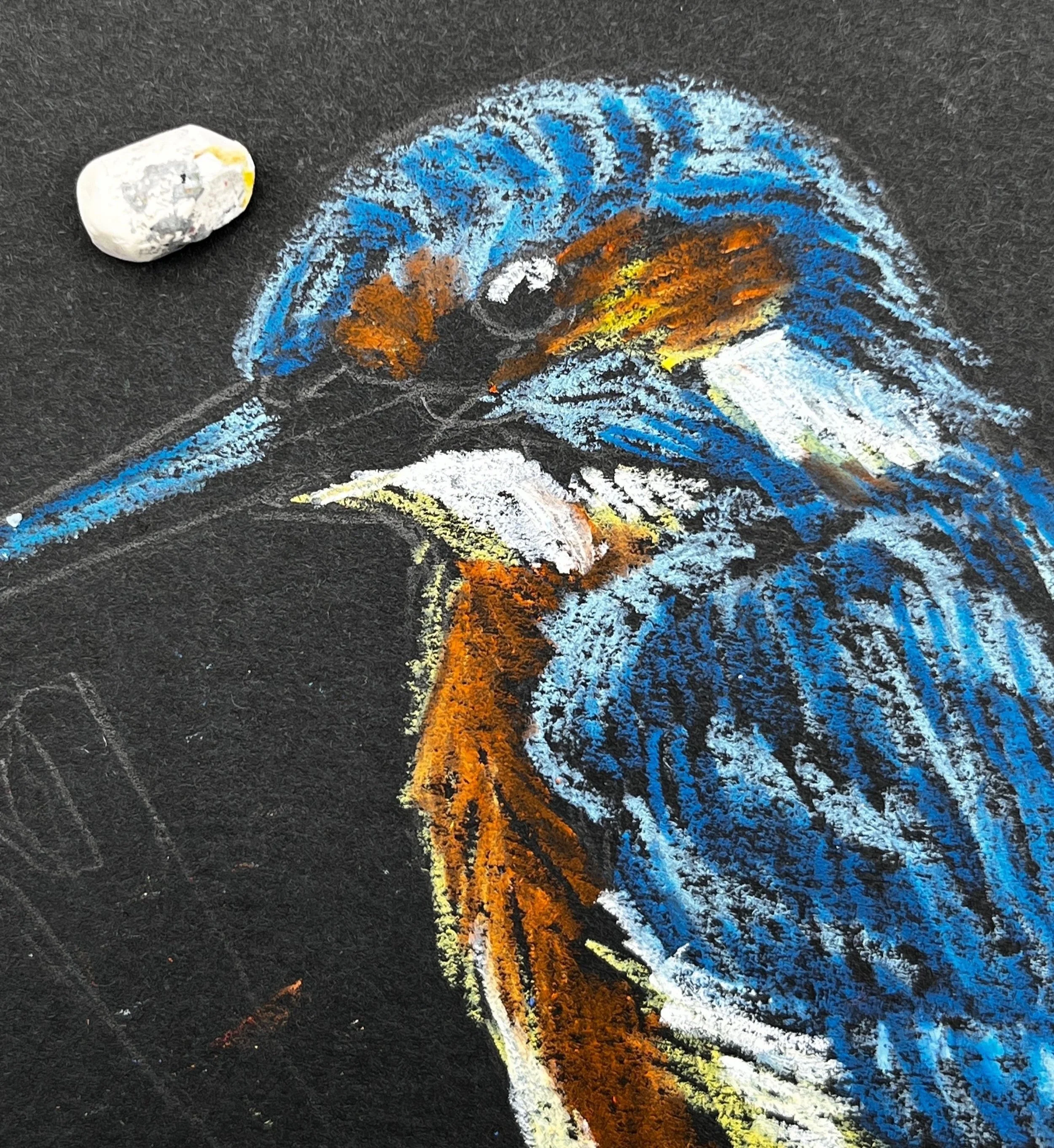
STEP 5
5. Next I go over the areas where I have already laid down a layer of color. For the orange chest area, I looked closely at the areas of light and dark within the orange and applied another layer of one, or both of the oil pastels I used previously. Before applying another layer of orange, to brighten the dark areas of orange pastel I very lightly applied a stroke or two of the pastel yellow. In this case it does not color the area, but it adds enough oil and pigment to give the orange pastel something to blend with and creates less transparency. The opaque color will also make the orange more vibrant. If you look closely within each color you will see lots of variation of shades. Squint your eyes and try to focus on the large areas of light and dark that you see left.

STEP 6
6. From here you can continue to go back and forth, layering the pigments up. Add light blue back on top in areas to create the suggestion of the patterns in the feathers. You will know you are getting close to where you want it to be when you start seeing areas of the painting blending and appearing more like paint than crayon. However, it is okay to see some black paper coming through in some areas. Select the areas where you want the pastel layers to be dense, but don’t worry about getting rid of the paper completely. Always build up slowly and thoughtfully. Remember, you can add more easily than you can remove what you’ve already applied.


STEP 7
7. Select a color for the branch. I selected a medium gray and then applied the olive green that will be the background color to the underside. This gives the sense of a reflected light. You do not have to be as careful or slow in building up the color on the branch. You can now blend a small amount of black into some lower areas to create shadow and white on the top edge, or you can wait to do it closer to the end.


STEP 8
8.At this point I begin the background. First I trace around the image leaving a black border between the background and the subject matter. This is my stylistic preference and is optional. Apply the background very loosely, leaving some of the black paper coming through. In order to do this well, you will apply the oil pastel with firmer pressure so that each stroke solidly covers the paper. This prevents the need to make multiple passes.


STEP 9
9. The last step is to touch up with the black pastel. First I apply it into the eye and on the beak. If you accidentally cover the white spots, don’t fret. You can simply come back and press your white pastel onto the spot again and leave another white dot on top. I blend a small amount of black into the darkest shadow areas in the blue feathers to create more contrast. I do not always add black to the black borders around the subject, but I do when I need to clean something up and create a sharper edge.

STEP 10
10. Remove the tape. Tip: To prevent damage to your paper, pull the tape very slowly and angled out rather than straight down. Don’t forget to sign your work!


That’s it! Did you find yourself enjoying the freedom of imperfection? If you have questions or comments be sure to leave them below.


Please, Don't Buy My Book... From Amazon
There is something sneaky going on in the online book market. Whatever it is, Amazon may be in on it.
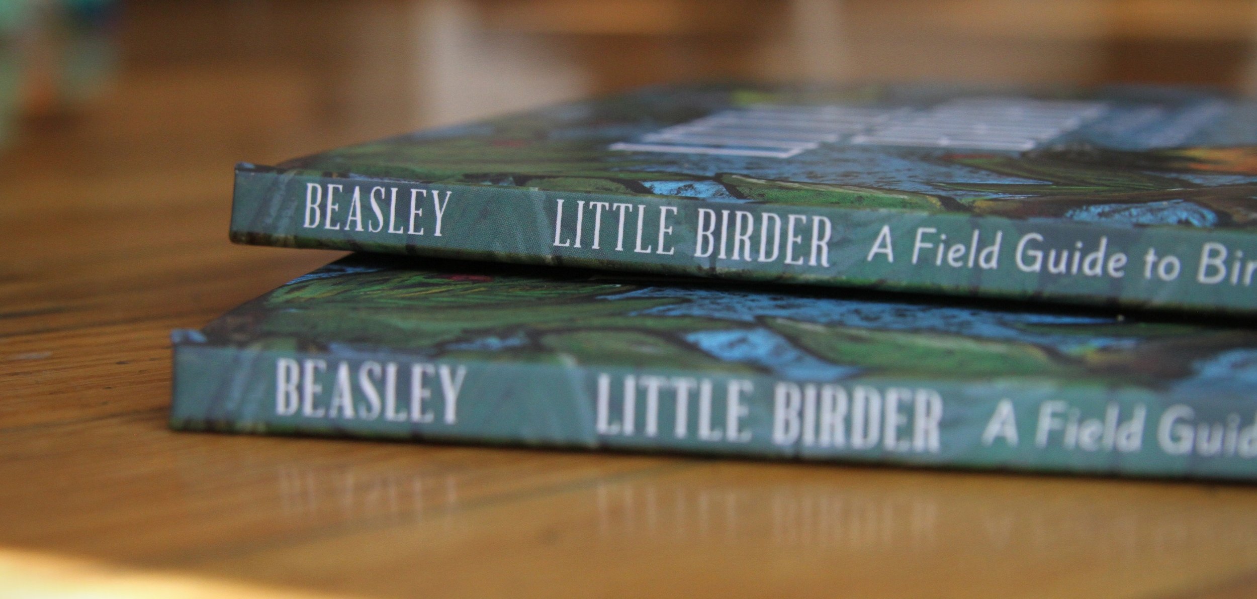
I recently self published my first children’s book, Littler Birder: A Field Guide to Birds of the Alphabet, using IngramSpark’s print on demand self publishing service. By doing so, my book is available on major retailers websites like Barnes and Noble or Amazon. It was one of the major reasons I decided to use IngramSpark’s service. But now I’m wondering, is the potential cost of selling my book on Amazon worth the potential gain?
Please, don’t buy my book from Amazon. Here’s why.
***PLEASE NOTE: This post was published a long time ago, and much has changed since its publication. One big change is that I no longer use IngramSpark for manufacture or distribution of my children’s book for much of the same frustrations mentioned in this post originally.
I have left the article published even though some of the information is no longer relevant because I think it is important that people who are interested in self-publishing or IngramSpark be aware of some of the set backs and frustrations I experienced in my process. So proceed with the understanding that in the end, I decided that IngramSpark and the accompanying presence on Amazon was not worth the heartache I experienced trying to sell a hardback, full-color, 60-page children’s book.
There is something sneaky going on in the online book market. Whatever it is, Amazon may be in on it.
First, here’s the story.
I recently self published my first children’s book, Littler Birder: A Field Guide to Birds of the Alphabet, using IngramSpark’s print on demand self publishing service. By doing so, my book is available on major retailers websites like Barnes and Noble or Amazon. It was one of the major reasons I decided to use IngramSpark’s service. But now I’m wondering, is the potential cost of selling my book on Amazon worth the potential gain? And here’s why.
While publishing, there were some high moments, some low moments and there were some downright confusing moments. One of these confusing moments came about a week after my publish date. My main source of sales was pre-orders directly from my website through personal marketing, but the book was also available to purchase by retailers through IngramSpark’s distribution channels. One day early in the process, I logged into my publisher’s account and noticed that I had 11 sales of my title. Exciting right? Actually, no. Unfortunately, one of those low moments that I mentioned previously was due to issues with the print quality of my first proof copies. I was forced to upgrade my printing before I published, and therefore had to pay more per book than originally expected, as well as increase the retail price. For the pre-order period and the first seven days after my book’s release, due to IngramSparks price change policies, my retail price increase was not yet effective. So, if a book sold through a retailer such as Amazon, I made less than $.10 per book. Yes, you read that right. I made less than ten cents per book. (I sold a book in the UK and OWED THEM $.09. Brilliant.)
So who bought these books? I assumed that some bird-lover with a new grand-baby had stumbled onto my listing on Amazon or B&N and pre-ordered my book, or someone who knew about my book made the mistake of purchasing through a retailer when they couldn’t figure out how to make a direct purchase from the author. I decided to see if I could tell by visiting the retailers’ websites. When I visited my book’s listing on Amazon, I saw something bizarre. My brand new book was for sale as expected, but along with that I saw the notorious, “5 new and used from $21.95." What?
Sure enough when I clicked on it, there were cheaper “used” copies of my book for sale. Someone, presumably someone with the ability to buy direct from the distributor, was purchasing my brand new print-on-demand book before the publish date, giving me my pennies-per-book and turning around as a third party book seller on Amazon and selling my book. But why? And why, or rather, HOW are they able to sell them as used books?
I began to investigate to see what I could find. Sure enough, it took a bit of digging and the right search engine wording, but I found just a few articles that alluded to the backhanded book sales on Amazon. It didn’t answer this mystery directly but it’s clear, there is a gray area when it comes to third-party book sellers on Amazon.
So please, don’t buy my book from Amazon.
Here’s why.
In the best case scenario, authors make minimal amounts on each book anyway. Even under the best practices, the trade discount for retailers is an egregious 55%. A best-selling book on Amazon makes them way more money than it does the author. Obviously, it isn’t all about the money for most authors. Most authors have something they want to share and it’s worth only making pennies per book if it gets it out there to the public. So the cost of getting their book to you, the lovely reader, is watching someone else get rich off of their hard work. So, if you can swing it- buy directly from the author. If you can’t, try buying it from the publisher. Then try a brick and mortar store locally, then a brick and mortar chain in your town, then a retailer that doesn’t allow third-party seller, and then lastly— Amazon. And make sure that you’re actually purchasing it from Amazon…
Apparently, third party sellers can now be the “default” option for purchase. This is one of those gray areas where the articles that I found know it’s happening but can’t clearly define all the details. There is a big question mark hanging out there in the book world. Recent changes have been made to Amazon’s “buy box,” or more simply, the “add to cart” button. Since these changes, when a person clicks that button to add a book to their cart, they might be purchasing from Amazon— who has to purchase directly from the publisher— or they might not. As a consumer, I don’t like to feel duped. I cringe at the thought of how many times I’ve pushed that button and assumed that the author benefits from my purchase, when in fact they get nothing. What’s worse for me is the thought that all those times I wanted to save a few bucks by buying a used book, the book might not have been used at all (weird) and the author might not have ever seen a penny on the purchase. Read this article for more on the new “buy box.”
Used books aren’t always what they seem. I love used books and so I was sad to learn that the waters are so murky on Amazon’s used book sales. If you’re like me, every time you purchase that worn out used book you feel like you’re saving the world from going all digital with landfills full of books. (I shudder at the image of my daughter as a teenager centered in a scene right out of one of those sci-fi books where physical books are a thing of the ancient past and they’re wearing all spandex for some reason.) I adore books, not ebooks or backlit words on a tablet, real paper books. Long live the books.
I didn’t find a good answer for why and how third party sellers can sell my brand new book at a discounted price, a week after the publish date, and sell it as a used book. But that is incentive enough just to avoid it. A week later, the “new and used” options were mysteriously gone on my childrens book’s listing. Did someone buy it, thinking it was used? Is there some other foul smelling explanation? I may never know. I want my book to land on a used book store shelf after being loved—or not— and find it’s way honestly into the hands of someone who can feel good about paying pennies and giving it a new life.

“…is the potential cost of selling my book on Amazon worth the potential gain?”
Confession time…
I’m a big fan of Amazon. In fact, I intentionally choose to use Amazon-smile at times so that my purchases give back, and who can be disappointed about free two day shipping? But up until now I didn’t know exactly the cost of my savings when it comes to this particular aspect of the world-dominating website. It makes sense that indie publishers who utilize print-on-demand services will fall prey to these schemes because of the ease of purchasing a single book at a wholesale price, allowing these sellers to make an easy buck at the expense of the author and the reader. I’m not sure exactly how this suspicious selling practice affects traditional publishers, but it does seem to have similar effect on traditional publishing, which in turn, directly affects readers because it is taking the profitability out of publishing and writing. This means, less risk taken on new authors, less money to publish new books and a decrease in the quality and quantity of work available to the public. There is more research to be done on this topic, but for now, please be conscientious about buying books on Amazon.
Click here to purchase my book directly from the author.
More interesting reads on this topic-
lifehacker.com- Why You Shouldn’t Buy a “New” Book on Amazon
vox.com- Amazon made a small change to the way it sells books. Publishers are terrified.
theguardian.com- Cheap books, high price: why Amazon.com’s ‘one-click’ sales can cost authors dear
